The VHS Cover Had to Sell the Movie in a Glance
A video-store customer could not sample a film with a trailer on a phone. The cover was the preview: a renter scanned a crowded shelf, made a quick judgment, and chose whether to take a chance. That made the packaging part of the movie’s practical distribution—not just decoration.
Why Red and Neon Worked
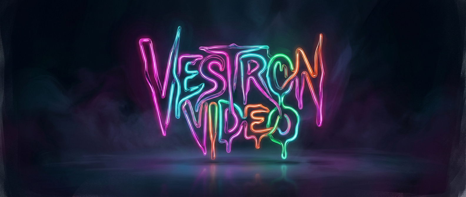
Against a nearly black background, bright lettering creates an immediate visual signal. Blood red suggests danger; electric colors can make a title feel strange or unreal. The contrast also helps words stand out when a case is packed between other cases and viewed under store lighting. The design could promise a mood before a shopper knew anything about the cast or story.
For a low-budget horror film, this was a useful kind of scale. A cover could imply a more intense, polished, or mysterious experience than the production’s limited resources might suggest. It could not change what was on the tape, but it could persuade someone to pick it up and read the back.
Packaging Shaped the First Impression
That promise carried a tradeoff: dramatic artwork might win attention, but it also set expectations the film had to meet. In a rental store, the choice happened at the shelf, and the cover’s colors and lettering did some of the work a trailer might do elsewhere. For horror, a few glowing words on black could turn an unfamiliar title into a visible invitation—or warning.