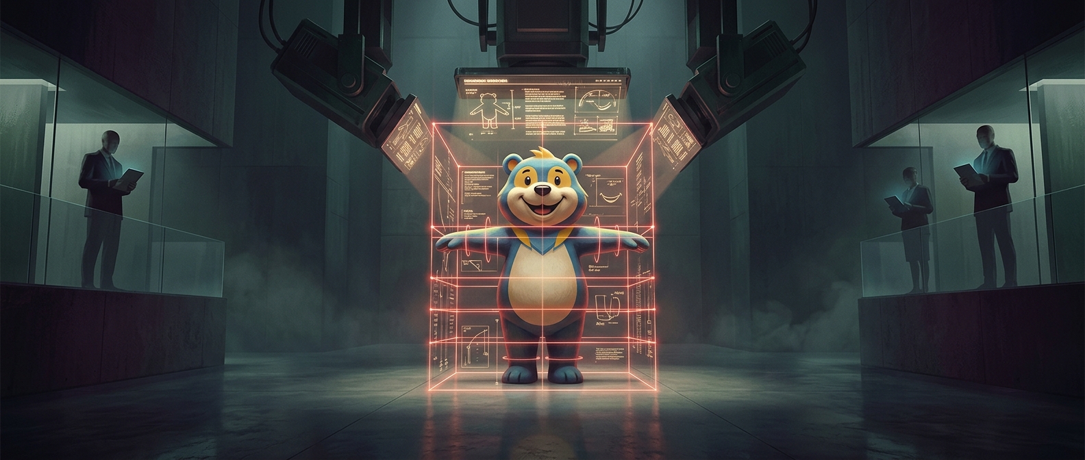
A mascot has to look like the same character everywhere
A brand mascot may appear on a cereal box, a phone screen, a costume at an event, or a small promotional sticker. Each version is made in a different size and medium, often by different people. A rulebook gives them a shared reference: how the character stands, what expressions are allowed, and how details such as the number of visible fingers should be drawn.
That precision matters because small changes can alter a character’s personality. A shifted posture might make a cheerful mascot seem timid; a different smile can make it look sly or unfriendly. Consistent choices help audiences recognize not just the character, but the tone the brand wants it to convey.
Rules make the character usable
Mascot guidelines are practical instructions for artists, designers, printers, and animators. They can show approved poses and expressions, explain which features must remain recognizable, and set limits on how the character may be changed. The goal is not necessarily to make every image identical. It is to let the mascot adapt to new settings without losing its identity.
A rulebook also prevents costly guesswork. Without a common reference, each new illustration could require fresh decisions about proportions, gestures, or facial expression—and those decisions might conflict with earlier versions. The rules turn a mascot from a drawing into a repeatable design system: flexible enough to appear in many places, but controlled enough that its next appearance still feels like the same character.