A closer look
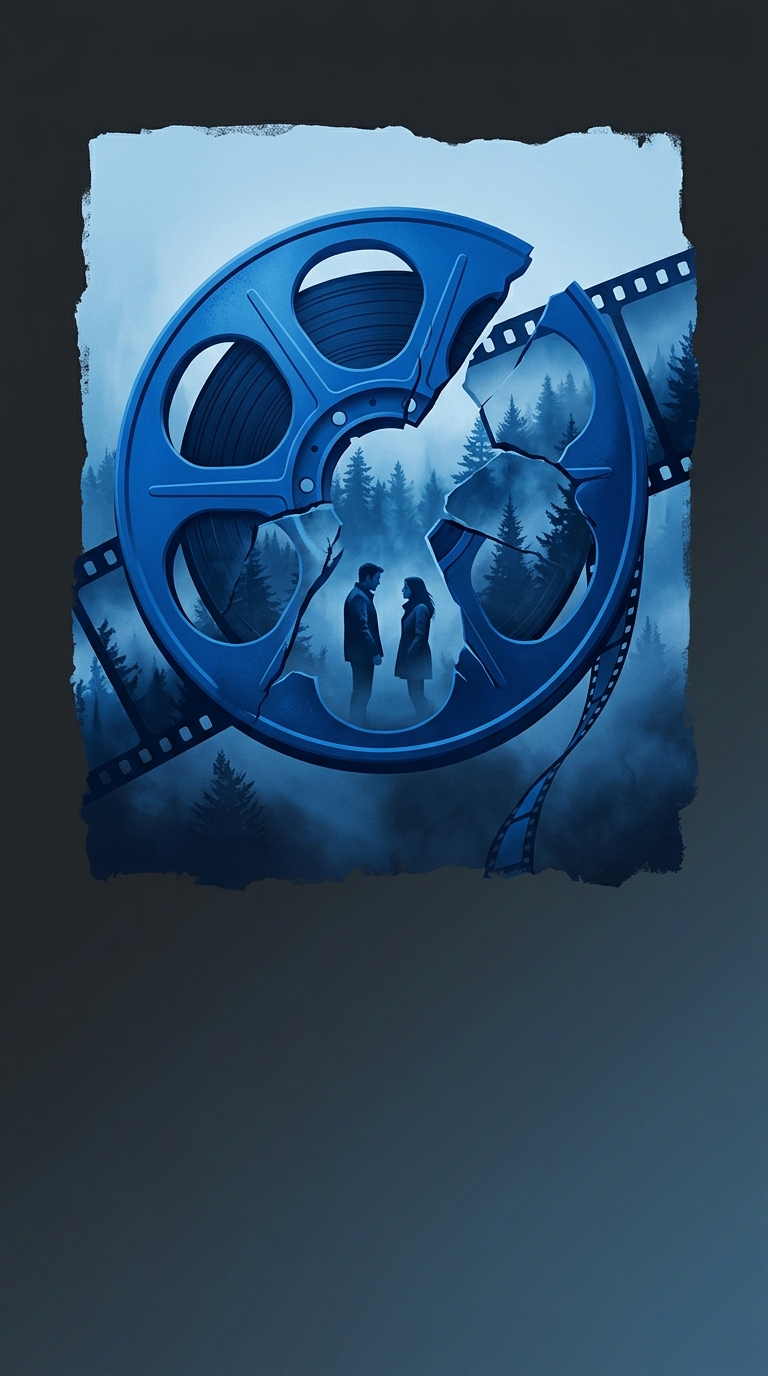
Director Catherine Hardwicke applied a massive, nauseating blue color filter over the entirety of the first Twilight movie to make the Pacific Northwest look as dreary and depressing as possible. The heavy-handed color grading made the entire cast look like they were suffering from severe hypothermia, which awkwardly fit the narrative of moody teenagers falling in love with immortal vampires. Future installments in the franchise completely abandoned the smurf aesthetic, leaving the original film as a bizarre visual time capsule of 2008 indie filmmaking trends. It is hilarious that the visual signature of a billion-dollar romance saga was essentially just an uncalibrated television screen!