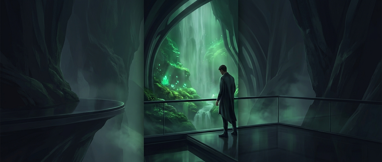
How Green Can Feel Like a Visual Exhale
A color does not need to trigger a conscious thought to shape a mood. The brain rapidly sorts visual scenes for meaning: Is this place familiar, threatening, busy, or inviting? Green can contribute to a sense of ease when it resembles the vegetation people encounter in landscapes they regard as restorative. That association may quietly tilt the first impression of a room or view toward “settled” rather than “on alert.”
The effect depends on the scene, not just the hue. A leafy view combines green with depth, natural shapes, and open space; a flat patch of bright green paint does not provide the same cues. Personal experience and culture also matter. Green can feel soothing in one setting and harsh or artificial in another, so it is better understood as an influence on perception than as a built-in calming switch.
Why the Surroundings Matter
In a room, green may work partly by changing what the space brings to mind. A muted wall color alongside wood, daylight, or plants can suggest a softer, more natural environment; the same color under stark lighting or among visual clutter may not. These details shape whether the setting feels comfortable before someone stops to analyze it.
That makes green a useful design cue, but not a substitute for the conditions that actually support well-being. The calming impression comes from the meaning of the whole environment, with color helping set the tone.