Why Cyberpunk 2077’s delay notice became a template
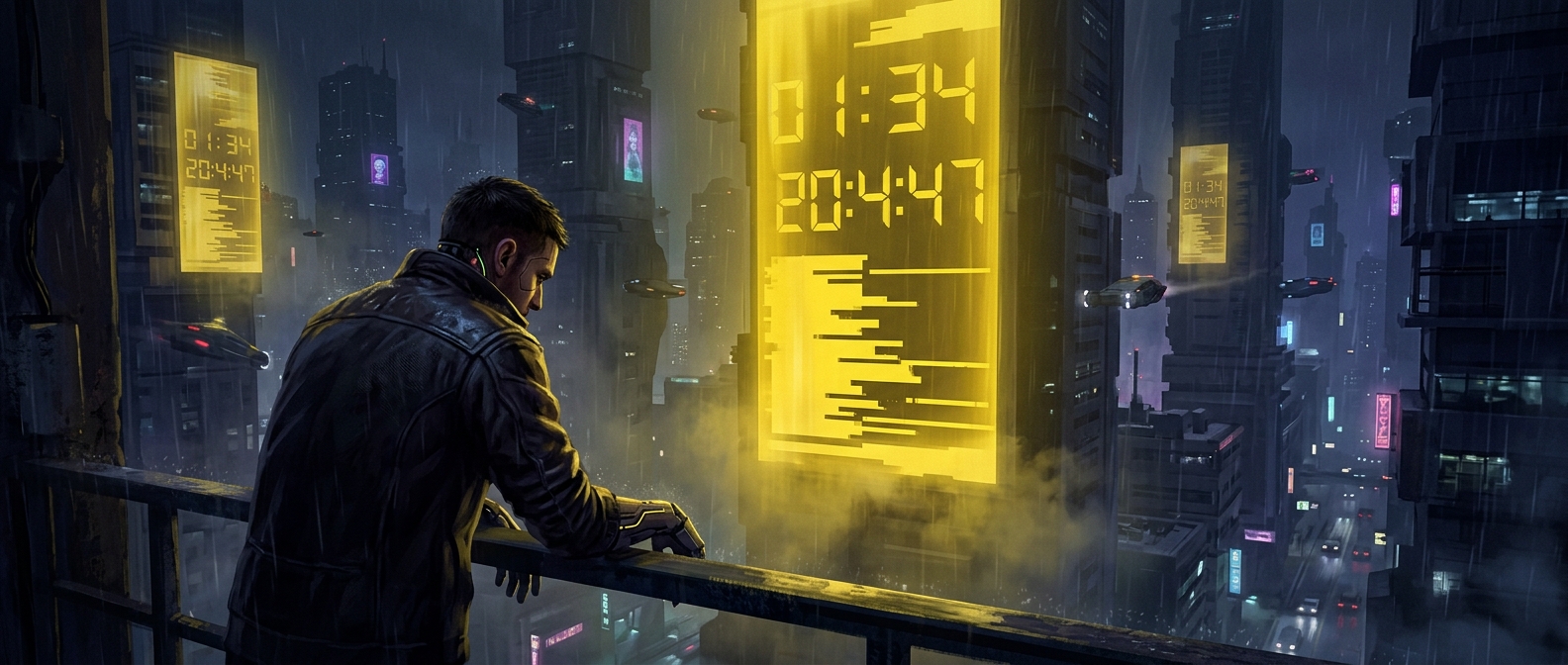
The yellow screen was designed to deliver bad news plainly: Cyberpunk 2077 would not arrive when players had been told to expect it. With each postponement, CD Projekt Red reused a similar apology format, making the announcement recognizable before fans even finished reading it. The bright color and formal, carefully worded message stood out against the usual stream of game trailers and promotional art.
Repetition turned an apology into a running joke
A single delay notice is an update. Repeated notices create a pattern—and patterns are easy to parody. By the fourth delay, fans could borrow the screen’s visual style and solemn tone to announce much smaller disappointments, such as discovering there was no milk left. The humor came from the mismatch: the template treated an everyday inconvenience with the gravity of a major game-release setback.
The joke also depended on shared context. Fans had watched the release date move several times, so the yellow notice carried the history of those announcements with it. Copying it let people acknowledge their frustration while making light of the wait.
The cost of being instantly recognizable
The screen’s meme life was a side effect of repetition, not simply a clever marketing campaign. Each reuse made the format more familiar, but also gave fans a ready-made symbol for another delay. Once a corporate apology becomes easy to imitate, its meaning can escape the company’s control: the same design meant to communicate seriousness can signal comic exasperation instead.
That is why the template worked for running out of milk. The joke did not need an explanation—just a yellow background and news delivered as if the world had been put on hold.