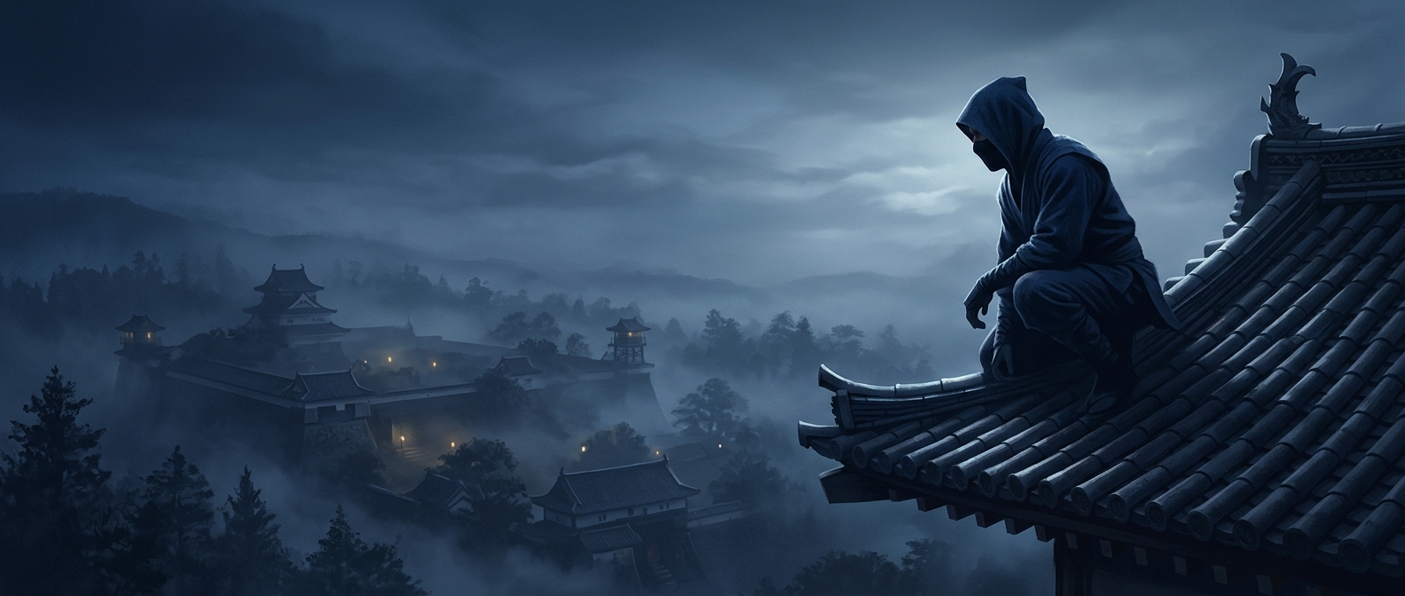
Why “dark” was not always dark enough
At night, clothing is judged less by its color name than by the contrast it makes with its surroundings. A black garment can look like a sharply cut shape against a faintly lit sky or pale wall. Very dark blue may sit closer in tone to shadowed surfaces, making the wearer’s outline less distinct in those conditions.
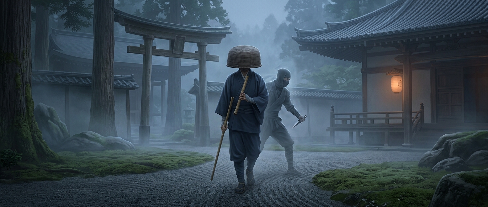
That is the practical logic behind accounts of Japanese covert operatives sometimes choosing navy rather than pure black. The aim was not to become invisible, but to avoid presenting a crisp, easily recognized silhouette.
The background decided the choice
Low light also changes what the eye can distinguish. As illumination falls, people become less able to perceive color and rely more on differences in brightness and shape. Navy can therefore appear almost black while retaining a little tonal variation; against a dark, uneven background, that variation may help it blend rather than read as a flat cutout.
No garment could work equally well against every nighttime setting. A dark outfit might disappear among shaded buildings but stand out against a lighter patch of sky. The useful choice depended on where an operative expected to move and what lay behind them.
The detail is a reminder that concealment was a problem of managing contrast, not simply wearing the darkest possible color. In the wrong light, even black can make a person easier to see.