Why a taller box can seem fuller
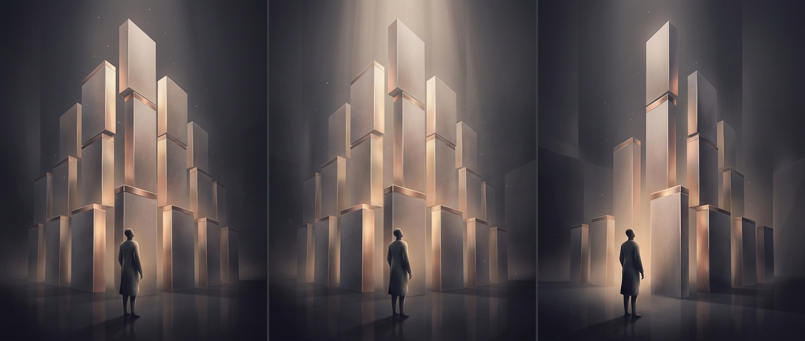
People do not judge a package’s capacity by calculating its width, height, and depth. When two boxes are viewed from the front, height can dominate the impression: a tall outline may look more substantial than a shorter one, even if the shorter box is wider and both have the same volume. The eye reads the tall shape as “more” before the shopper has any reason to compare dimensions.
That impression can affect how much cereal a shopper thinks they are getting. The box’s silhouette acts as a quick visual cue for abundance, while the actual quantity is determined by what is inside—not by how much shelf space the package appears to occupy.
The package is part of the selling decision
A cereal box has to do more than contain food: it must present the product clearly on a crowded shelf. A narrow, upright shape can make a brand easy to see, while its proportions may also make the package seem more generous. That creates an incentive for packaging designers to consider not just capacity, but how capacity looks to a shopper.
The distinction matters when comparing boxes. A taller package is not proof of more cereal; the net weight is a better guide to the amount of food. Packaging can shape perceived value even when the contents do not change.