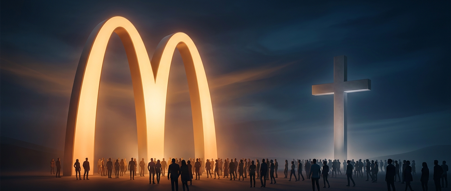
Why the Golden Arches Travel So Well
A logo has an advantage when it can be recognized at a glance, from a distance, and without needing words. McDonald’s arches reduce the restaurant’s identity to a bold, simple shape: two curves meeting in the middle. That shape can be printed on a package, mounted on a roadside sign, or displayed above a storefront while remaining recognizable.
For travelers, that consistency matters. In an unfamiliar place, a familiar mark can signal a known stop before someone can read the local language or inspect a menu. Repeated encounters—with signs, packaging, and restaurants—make the shape easy to retrieve from memory. Recognition is not the same as knowing anything about the company, but it does mean the symbol has become a portable landmark.
A Different Kind of Symbol
The Christian cross carries religious meaning, but it appears in many forms and settings: as a plain outline, an ornate object, or part of a larger image. The arches, by contrast, usually point to one specific commercial identity. A survey asking whether people can identify a symbol may therefore reward quick, consistent visual recognition more than cultural or religious understanding.
That contrast helps explain the finding without making the two symbols equivalent. One is a corporate logo encountered through a standardized global brand; the other is a religious symbol whose meaning can be profound even when a person does not identify a particular depiction on sight. For someone on the road, the practical result is simpler: a pair of yellow curves may be easier to spot than a sign written in an unfamiliar alphabet.