A printer’s case made the distinction visible
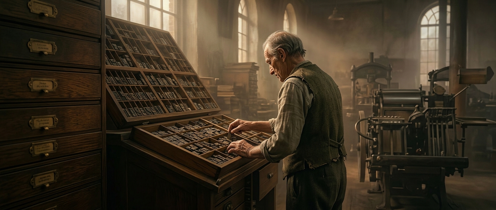
Before type was printed, each letter was a small piece of metal with a raised, reversed shape. Printers kept these pieces in divided trays, called cases, so they could quickly find the letters needed to assemble a line of text. The larger forms used for capitals were stored in the upper compartments; the smaller, more frequently used forms went below.
From workshop shorthand to everyday language
A typesetter reached upward for a capital and down for a small letter. “Uppercase” and “lowercase” began as practical names for those locations, not as descriptions of how the letters looked. The labels outlasted the physical trays and became the standard terms for the two forms of the alphabet.
The arrangement also reflected the work of setting type: capitals appeared less often, while small letters filled most words, so keeping them in easier-to-reach lower compartments made handling the type more efficient. Today, the words preserve a small trace of that manual process—even when there is no case, metal type, or printer’s workshop in sight.