A familiar puzzle, reshaped into levels
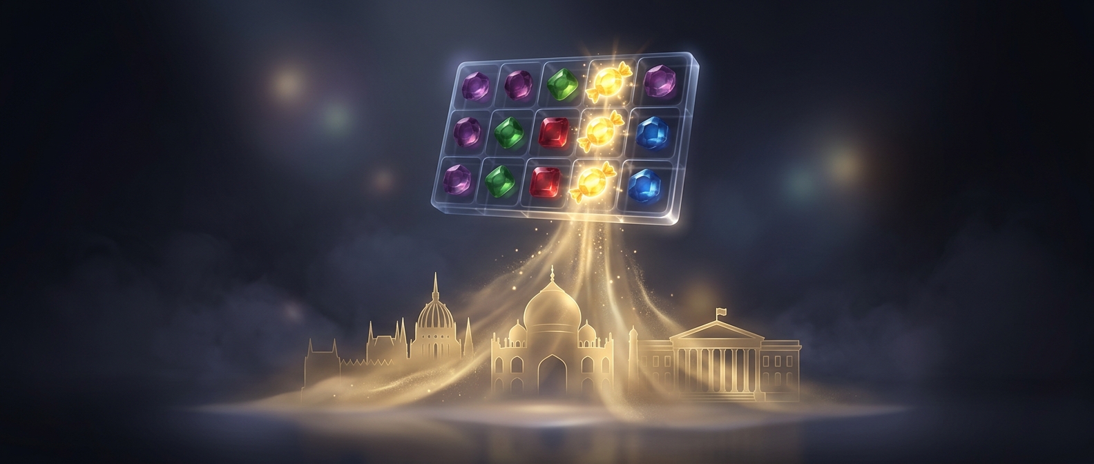
Candy Crush Saga used a simple rule players already knew: swap neighboring candies to make matches and clear them from the board. Its key design move was to wrap that repeatable action in levels with specific goals—such as clearing certain pieces or reaching a score before moves run out. Each board became a short, self-contained challenge, while new layouts and objectives kept the same basic rule from feeling identical every time.
Bright colors, animations, and sound made matches easy to read and satisfying to complete. They also made success legible at a glance: a cleared obstacle or a chain reaction showed the player that a move had mattered.
Where play meets payment
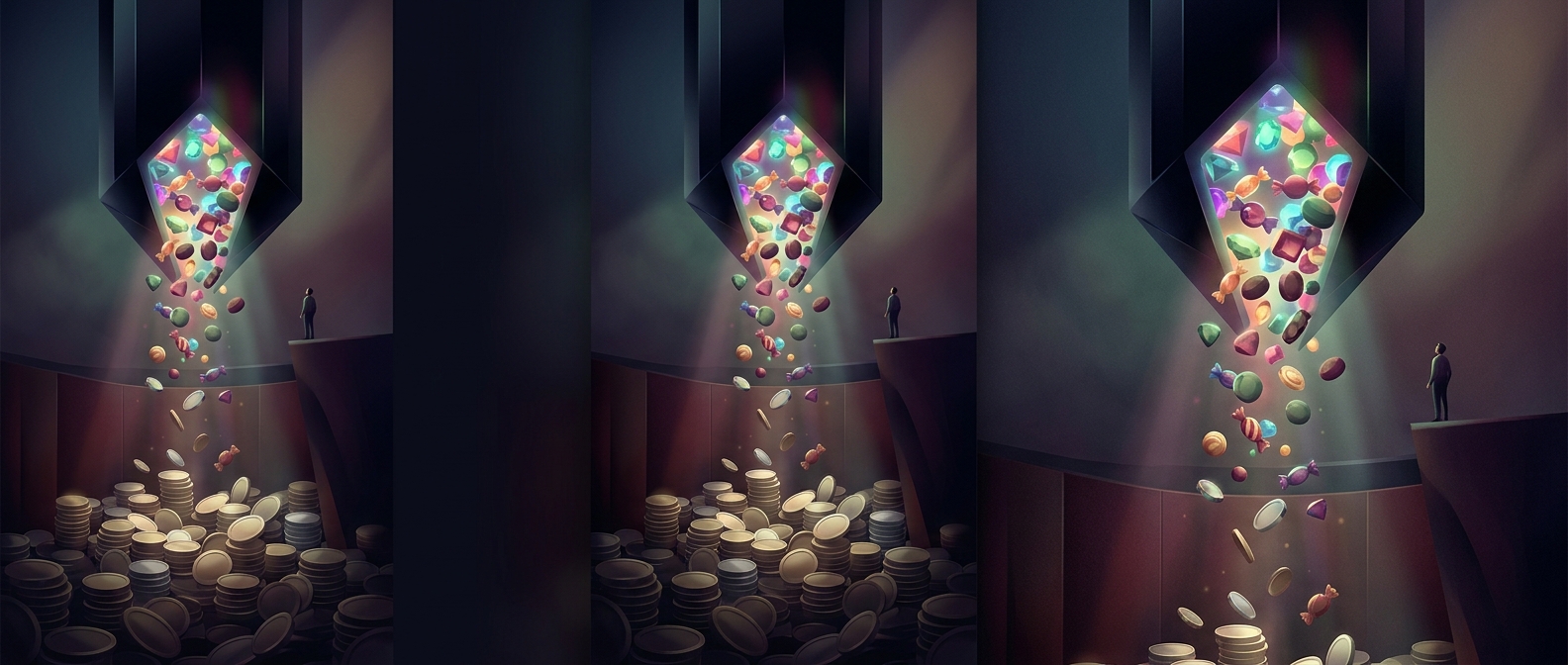
Difficulty created the commercial opening. A player who ran out of moves near a level’s goal could stop, try again, or use paid help, such as extra moves or a booster. Lives limited how many failed attempts could be made in a row, creating a pause between sessions. The purchase offered a way around a specific frustration, not a requirement to understand the game.
That structure connected repeated play to optional spending. Most turns were free and quick; a difficult board could make a small purchase feel like a shortcut to finishing a challenge already underway. The design depended on keeping both sides in balance: levels had to be demanding enough for help to seem useful, but not so punishing that players simply quit.
Why the formula scaled
Because the core interaction was familiar, players needed little instruction. The level system could then supply variety and a steady succession of goals, while the purchase options were attached to moments when progress stalled. That combination helped transform a basic matching puzzle into a long-running service: the same small action could bring players back, while the occasional obstacle gave some of them a reason to pay.