Why Book Covers Became So Bold and Abstract
A cover now has to work in two very different settings: held in someone’s hands and shrunk to a small rectangle on a phone or shopping page. Fine detail and subtle imagery can vanish at thumbnail size. A large, high-contrast shape, a few strong colors, and clear lettering are more likely to register before a reader scrolls past.
That practical pressure helps explain the rise of covers built around vivid graphic forms—sometimes loose, blob-like shapes rather than literal scenes. The design does not need to show a character or a specific moment. It needs to catch the eye and create a feeling quickly.
A Shape Can Signal a Genre Without Giving Away the Story
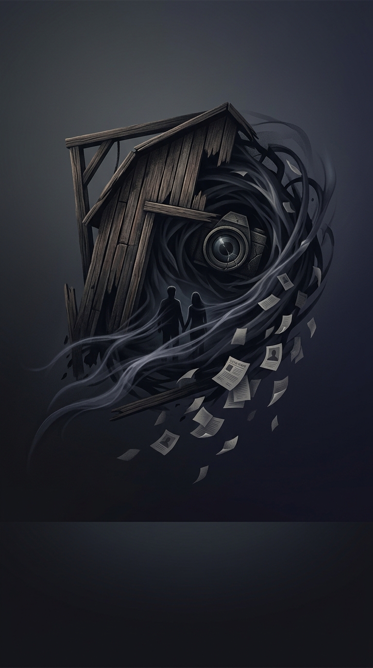
Abstract art also gives designers room to suggest a book’s mood without illustrating its plot. Soft, flowing forms can feel playful or romantic; sharper contrasts and darker palettes can suggest tension. These cues are not a fixed code, but they let a cover hint at the reading experience while leaving the story itself open.
That flexibility matters to publishers trying to reach readers who may not recognize an author’s name. A distinctive palette or graphic style can help a title stand out, while choices familiar to a genre’s audience make it easier to identify what kind of book it is.
The Look Is a Tool, Not a Single Trend
Bright abstract covers are not the result of one sudden decision, and they have not replaced every other style. They fit a market where covers must be legible at small sizes, recognizable in a crowded feed, and adaptable across print and digital formats. The blob is useful precisely because it can be decorative, emotionally suggestive, and visually prominent without competing with the title.
The result is a cover that often behaves less like a miniature illustration and more like a compact signal: color and shape do the catching; the title and description do the explaining.