When a menu’s effort becomes a signal
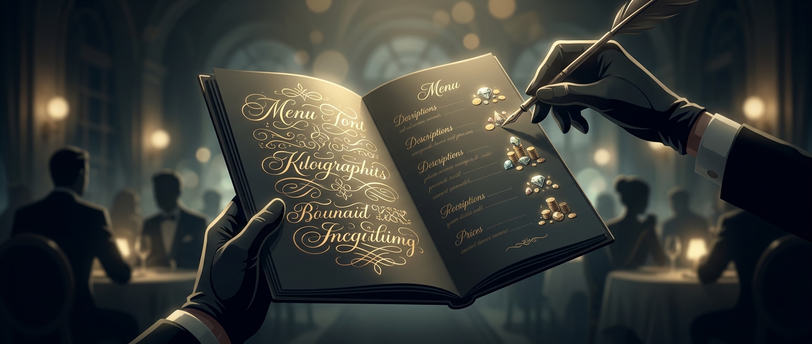
A diner cannot see the hours of prep behind a dish or know how carefully its ingredients were chosen. Before ordering, the menu is one of the few clues available. An ornate script can therefore act as a signal: it makes the restaurant’s presentation feel deliberate and handcrafted, and diners may extend that impression to the food itself.
This is a shortcut in judgment, not evidence that the kitchen actually used more skill. When a description takes effort to decipher, that friction can make the item feel less ordinary. The same dish may seem more distinctive—and its price more justified—because the menu frames it as something special.
The economics of a small cue
Restaurants compete not only on what they serve but on what customers expect to experience. A visual cue that raises perceived craftsmanship can help distinguish a restaurant from cheaper alternatives and make a premium feel coherent. The menu does not have to claim that a dish is handmade; its style can suggest care before the first bite.
That suggestion has limits. If the lettering is so difficult to read that customers struggle to find ingredients, compare prices, or order confidently, the cue becomes a cost. It can frustrate diners and make the restaurant seem less welcoming. The design works best when it adds atmosphere without obscuring the information people need.
So the tradeoff is not simply elegance versus plainness. It is how much difficulty a restaurant can turn into perceived craft before that difficulty gets in the way of choosing dinner.