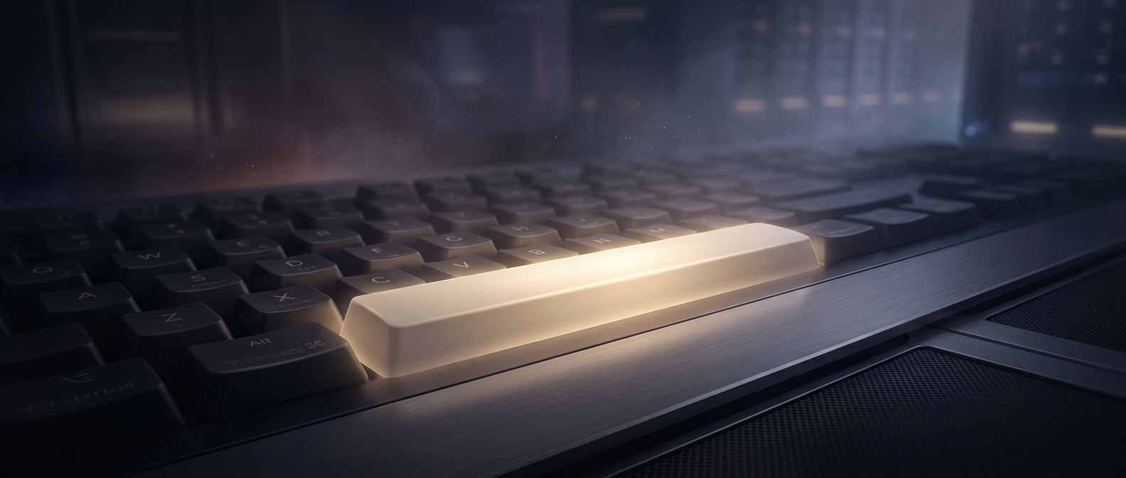
A key that makes a mark by doing nothing
On a mechanical typewriter, most keys sent a typebar—the metal arm carrying a letter or symbol—against the paper. The spacebar worked differently. Pressing it advanced the carriage, which held the paper, by one character position without printing anything. That empty position became the gap between words.
Its effect was visible in the growing line of text, even though the key left no ink of its own. A label would have named an action that users could quickly recognize from the blank space it produced.
Why the bar is so wide
A space appears between almost every pair of words, so typists press the space key constantly. Making it a long bar lets either thumb reach it without moving far from the home row, where the fingers rest while typing. Its size also makes the key easy to distinguish by touch among the smaller letter keys.
That shape carried over as keyboards changed. Electronic keyboards no longer need a carriage to move: pressing the spacebar sends a signal that the computer interprets as a space character. But the key still performs the same familiar job, and its long, blank surface remains easy to find.
Familiarity replaces the label
The spacebar is a quiet example of interface design: a control can be understood through its position, shape, and repeated use rather than through words printed on it. Once generations of typists learned to recognize the long bar as the way to separate words, labeling it offered little practical benefit. Its most important output is still the gap it leaves behind.