How a Logo’s Shape Sets a First Impression
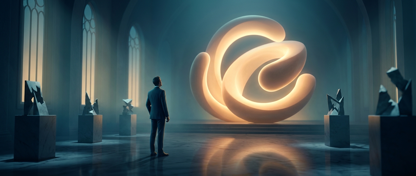
People often respond to shapes before they consciously inspect what a logo depicts. Rounded forms have no obvious points or corners to signal as potential hazards, so they can read as softer and more approachable. Angular forms, by contrast, can suggest edges, speed, or force. These are quick associations, not reliable judgments about a company’s actual character.
A Small Design Choice With a Business Tradeoff
For a company, a logo is a compact cue encountered on packaging, storefronts, apps, and ads. Rounded lettering or symbols may help a brand seem welcoming, especially when it wants customers to expect ease or personal service. Sharper geometry may better suit a brand trying to convey precision, performance, or intensity.
The choice is not simply “friendly” versus “aggressive.” Too much softness can make a design feel childish or indistinct; too many sharp points can make it seem harsh or difficult to approach. Designers balance shape with color, type, and the product itself so the visual cue supports the impression the business wants to make.
The Shape Is a Cue, Not a Promise
A logo can influence expectations, but it cannot establish trust on its own. That depends on what customers experience afterward: whether the product works, the service is dependable, and the company behaves consistently. The practical value of rounded forms is more modest—and more immediate: they can make a first encounter feel a little less severe before a customer has read a single word.