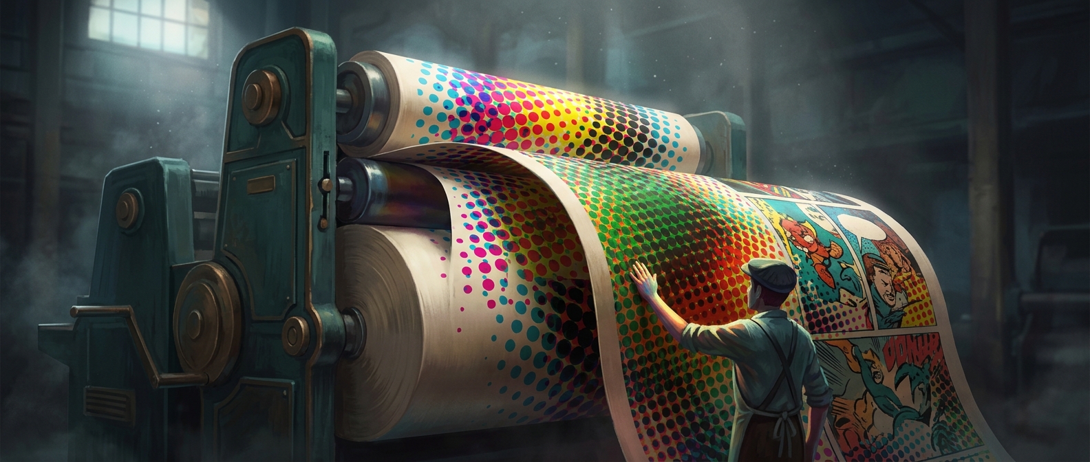
How Four Colors Can Make a Comic Page
A comic’s printed colors are usually built from tiny patterns of separate inks rather than from a custom mix for every shade. In standard process printing, the inks are cyan, magenta, yellow, and black—often shortened to CMYK. Each color is printed as its own pattern of dots. Where patterns overlap, the inks absorb different parts of white light, so the paper reflects a color our eyes perceive as a single hue.
The dots also create lighter and darker areas. A pale patch contains relatively few inked dots; a darker patch has more coverage. From ordinary reading distance, the eye blends those small marks into continuous color. Move close enough, and the illusion breaks apart into the distinct patterns.
Why the Dots Must Be Carefully Placed
Each ink color needs its own printing plate or equivalent image layer. The layers must line up closely—a requirement called registration. If one layer shifts, colored edges can appear around outlines that should be crisp. Printers can also angle the dot patterns differently to reduce unwanted visual interference, which can make regular patterns look like ripples or rings.
Newspaper stock adds another constraint. Its absorbent, relatively rough surface can spread ink and soften fine detail, so the dot pattern has to remain printable on the paper rather than merely look sharp on a screen. The result is a practical compromise: enough dots and color layers to suggest smooth shading, but patterns sturdy enough to survive the press and the page.
A Close-Up Reveals the Printing Method
The dots are not decoration added to the drawings; they are the mechanism that turns a limited set of inks into a broad range of apparent colors. That is why a bright patch in a Sunday comic can look seamless from across the breakfast table yet resolve into separate ink spots under a magnifying glass.