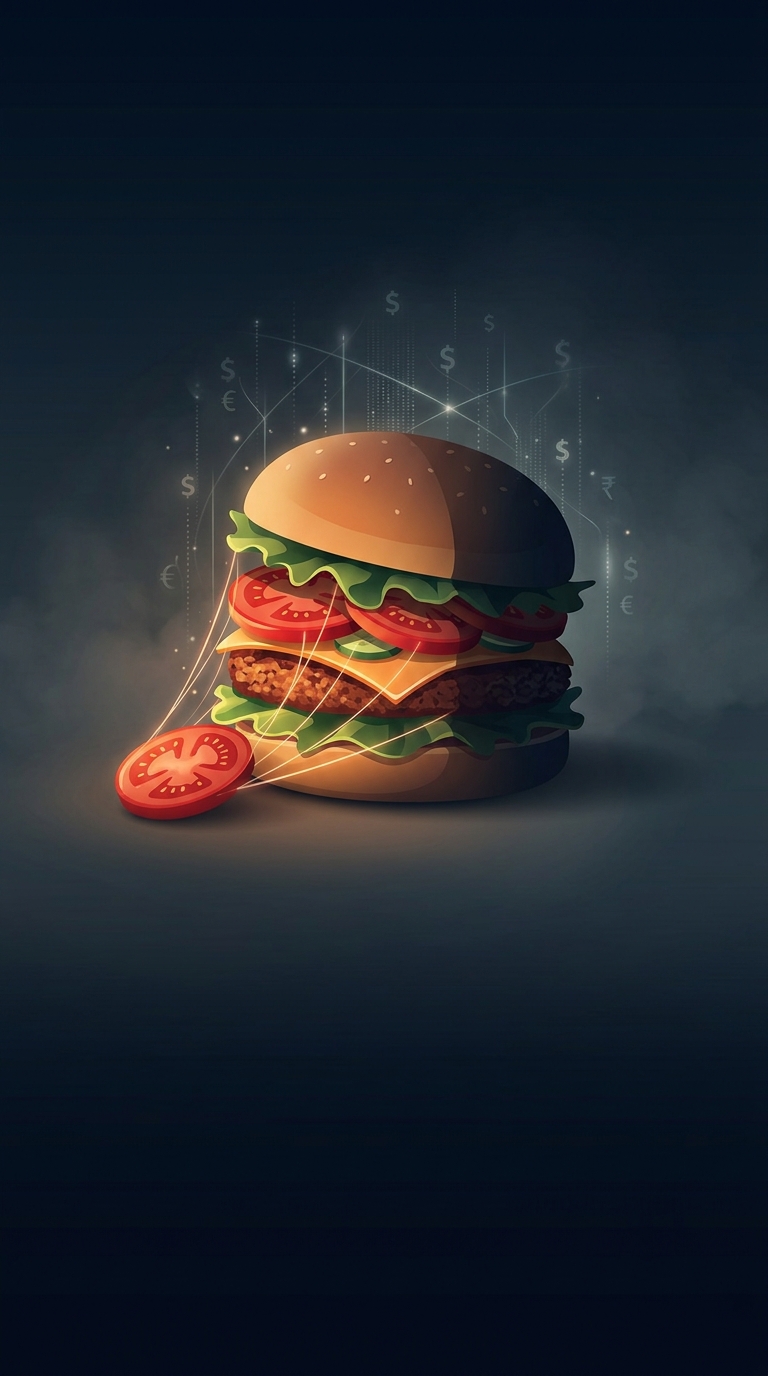
Why the Burger’s Ingredients Face the Camera
A burger in an advertisement is arranged to be read at a glance. From the camera’s viewpoint, a neat stack can hide its fillings: lettuce disappears behind the bun, a tomato blends into the patty, and a slice of cheese may barely show. Moving the ingredients toward the front turns the burger into a miniature display, with each layer visible at once.
That matters because a still image has only a moment to communicate what is inside. The visible lettuce, cheese, and tomato act like labels: they signal freshness, variety, and abundance before a viewer has time to inspect the picture. A burger that looks taller and more layered can also feel more substantial, even if its overall size has not changed.
The Camera Changes the Build
Food stylists arrange the burger for the lens, not for the way someone would normally assemble one to eat. They may shift ingredients toward the camera-facing edge and adjust the bun or filling so the layers form a clear outline. The chosen angle then makes that carefully arranged front edge look like the burger’s natural shape.
This is a tradeoff between a convincing product and a legible image. A perfectly centered stack may look tidy but conceal the very ingredients the advertisement wants to sell. Pushing them forward can make the burger look less like a practical meal and more like a cutaway display—but it lets the viewer see what they are being invited to want.
The result is a small piece of visual merchandising: the burger is built not just to be eaten, but to make its contents instantly recognizable on a screen or billboard.