Why Greenland Looks So Large on Many World Maps
Greenland is the likely answer. On many familiar rectangular world maps, it appears comparable in size to Africa, even though Africa is vastly larger. The mismatch comes from the way the map turns Earth’s curved surface into a flat image—not from Greenland’s actual dimensions.
The distortion grows toward the poles
A common map projection, called Mercator, was designed to preserve local directions and shapes well enough for navigation. To flatten the globe while doing that, it stretches the map more and more as it approaches the poles. Greenland lies far north, so its outline is enlarged substantially. Africa sits much closer to the equator, where the same projection causes far less enlargement.
The result is a visual comparison that can mislead: Greenland seems to occupy an enormous share of the map, while Africa appears much smaller relative to it than it really is. On a globe, or on a map designed to show area accurately, that impression changes dramatically.
A map is a choice, not a neutral window
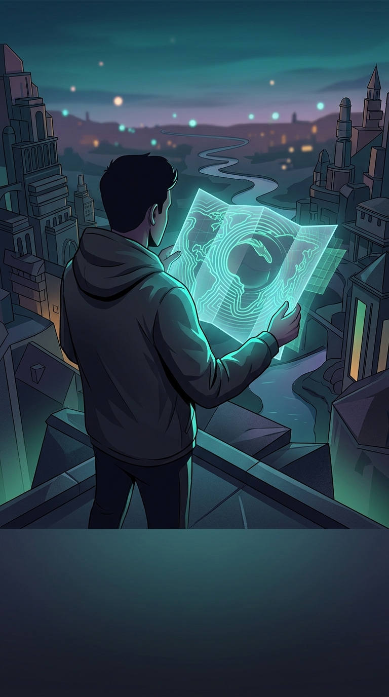
No flat map can preserve every property of a spherical Earth at once. A projection may prioritize direction, shape, distance, or area, and each choice introduces a different kind of distortion. Mercator’s usefulness for navigation helped make it familiar, but its polar stretching can make high-latitude places seem outsized.
So when Greenland looks almost continent-sized on a wall map, the striking detail is not that the island has somehow changed—it is that the map’s geometry has.**