A brand emblem, not a historical portrait
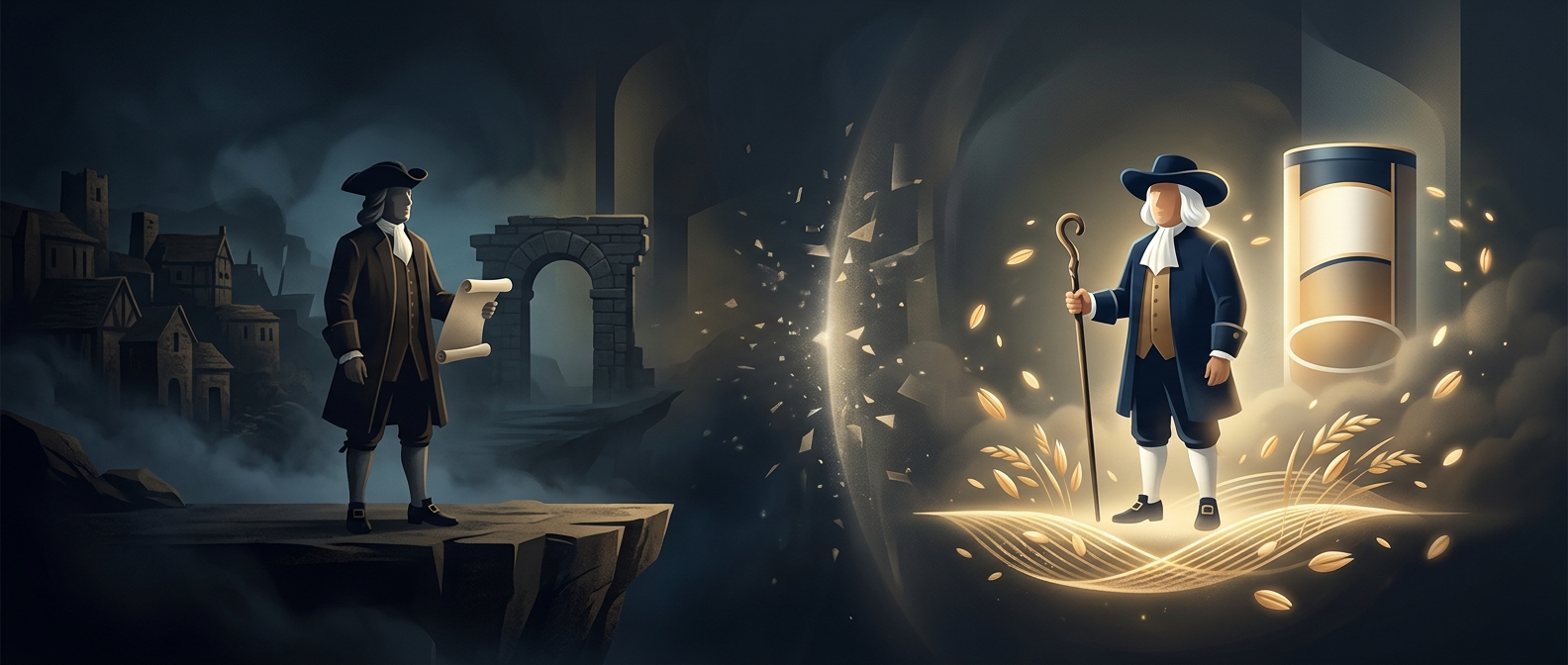
The face on a Quaker Oats package can look like a portrait of William Penn, the 17th-century Quaker who helped found Pennsylvania. But the company says its figure is unnamed—not Penn or another identified person. The resemblance is an association viewers make, not a biographical claim built into the logo.
That distinction matters because Quaker clothing signals a religious tradition, not one particular Quaker. Penn was a famous member of that tradition, but the group included many people, and its plain clothing was not a personal uniform that could identify him on sight.
What the image communicates
A logo does not need to depict a real individual to feel familiar. The Quaker figure works as a recognizable symbol attached to the brand; over time, seeing the same face on packages can make it seem like a named character from history. Penn’s prominence gives viewers an easy identity to supply, even though the company does not make that identification.
The result is a small but revealing gap between a logo’s appearance and its meaning: the package offers a Quaker image, while the familiar name “William Penn” comes from the viewer. The man on the box is best understood as a brand symbol, not a likeness of Pennsylvania’s founder.