Why Wendy’s collar can look like lettering
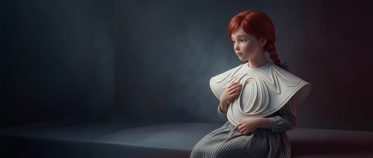
In Wendy’s logo, the ruffled collar is drawn with small, repeated curves and gaps. When those shapes line up, some viewers can read them as the lowercase letters in “mom.” The effect comes from an illustration that can be seen two ways: as fabric folds or as a familiar word.
That kind of word-finding is a normal feature of visual perception. The brain looks for recognizable patterns, especially in compact images where details are crowded together. Once someone points out “mom,” the collar’s marks may seem to spell it—but the resemblance is an interpretation, not evidence that the letters were deliberately designed into the logo.
A memorable coincidence, not a hidden message
Company executives have said the resemblance was unintended. The distinction matters: a shape can acquire meaning for viewers even when its designers did not put that meaning there. In this case, the collar’s decorative lines invite a second look, and the word people think they see becomes part of the logo’s lore.
The tiny message, then, is less a secret than a reminder of how readily the eye turns visual patterns into words.