How a muted green keeps the scenery in charge
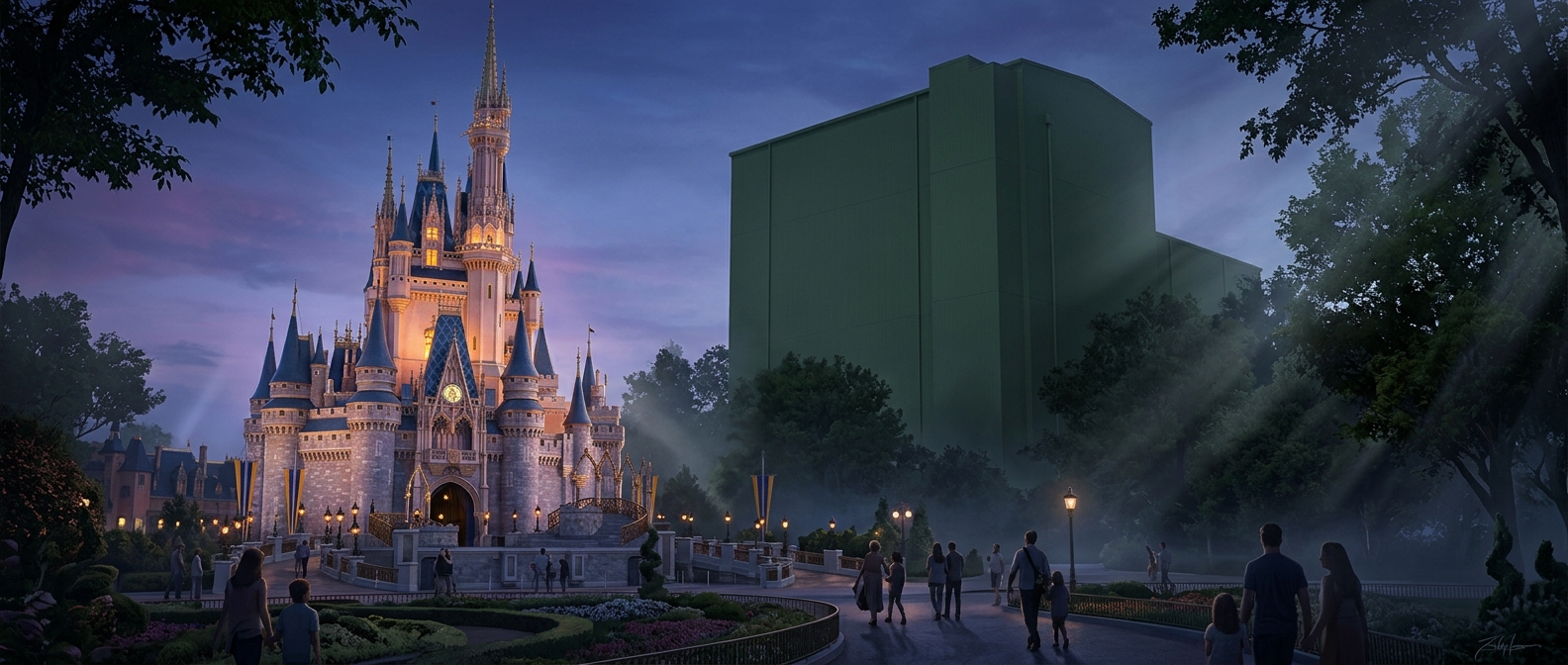
A fence beside a leafy path competes with everything around it: the plants, the architecture, and the attraction ahead. A subdued gray-green finish can make that fence less noticeable because it echoes the colors and low contrast already common in foliage and shade. The eye has fewer reasons to single it out.
The paint does not make an object disappear. Its effect depends on where the object sits and what surrounds it. A green utility box against bright pavement may still stand out; the same box tucked near shrubs and shaded walls can recede. The goal is to reduce visual contrast, not to match every background perfectly.
Attention is part of the design
Theme parks guide visitors’ attention with more than signs and lighting. Bright colors, detailed façades, movement, and sound make attractions visually prominent. Meanwhile, practical elements—such as fences, service structures, and equipment—can be finished in quieter tones so they compete less for notice.
That contrast helps preserve the impression of a carefully composed scene. Visitors may not consciously register the paint choice; they simply have fewer ordinary objects interrupting the view. The attraction gets noticed not because the surroundings vanish, but because the surrounding details are made less assertive.
Why it works only in context
A muted color is not a universal disguise. Its usefulness changes with light, distance, and nearby materials, and it cannot hide an object’s outline or movement. But in the right setting, lowering its contrast can be enough to keep a practical structure from becoming the first thing a visitor sees—leaving the main view to do its job.