Turning a Sound Into a Shape
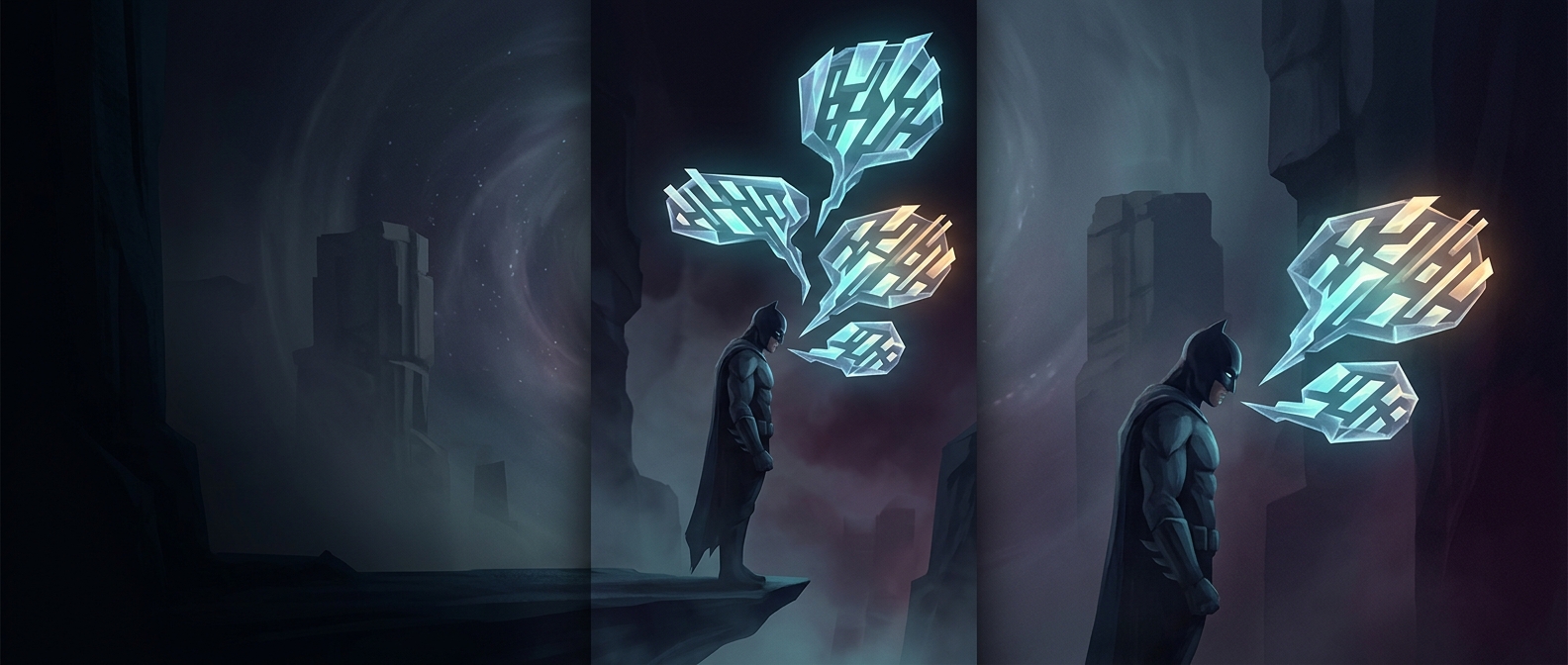
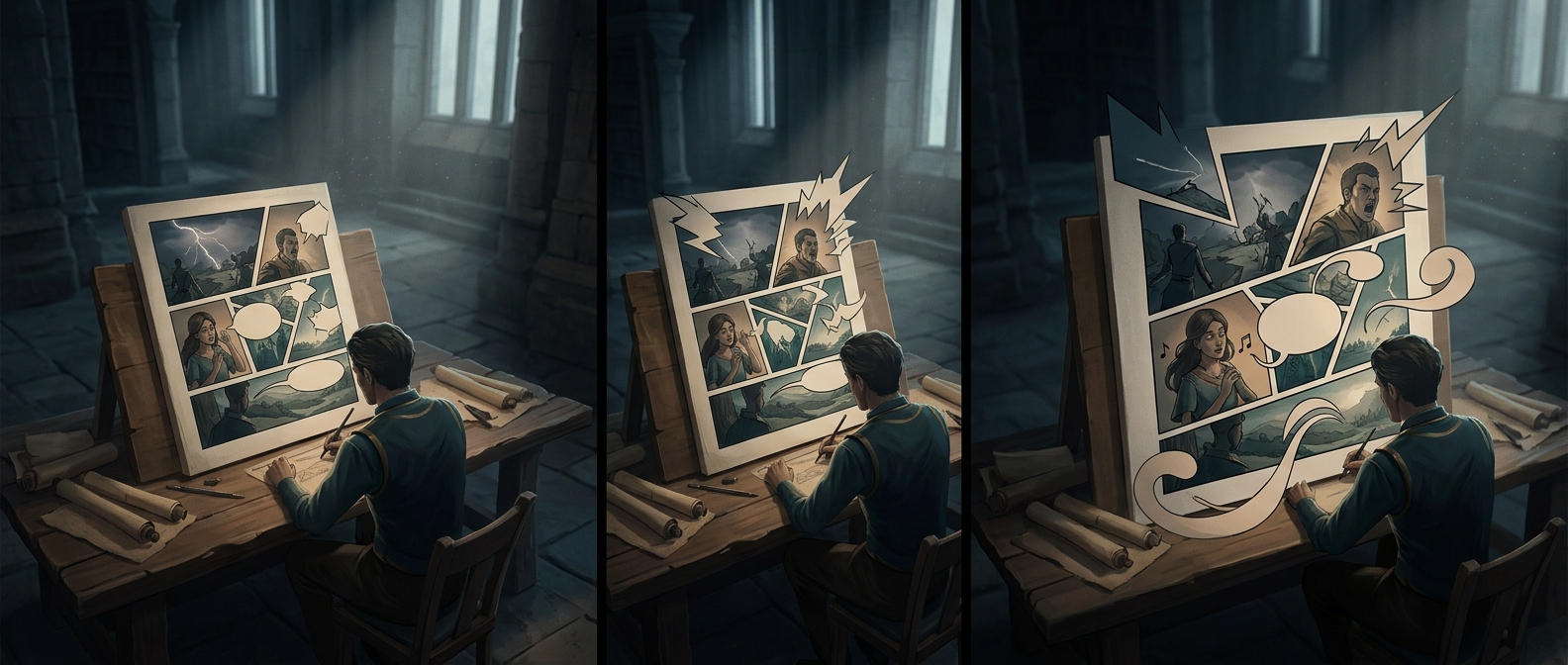
A comic cannot make a reader hear a scream, so it gives the sound visual properties instead. Letter size suggests volume; thick, uneven strokes can make a voice feel strained or ragged. The jagged outline of a burst-shaped balloon adds another cue: its sharp points seem to radiate force, unlike the smooth curve of ordinary speech.
These marks work together as a kind of visual shorthand. A large, jagged “Aah!” reads as an outburst before the reader has finished parsing the letters. The balloon’s shape also separates the scream from calm conversation, signaling that something has changed in the scene.
Making the Scream Fit the Page
The lettering still has to be readable and placed in the right order. Comics guide the eye from panel to panel and from balloon to balloon, so a dramatic scream needs enough space to stand out without obscuring a face, action, or later line of dialogue. Its size and position can direct attention toward the character or event causing the sound.
That balance is why the effect is more than decoration. The scream can interrupt the page visually while remaining part of its reading path: the reader notices the disruption, then continues through the scene. The page makes a sound feel forceful by changing the shape and rhythm of reading—not by adding actual noise.