One show, several ways into the story
A thumbnail is a tiny piece of advertising: it has to suggest what a show feels like before a viewer reads its description. For a series that mixes teen relationships with supernatural horror, different images can emphasize different parts of the same story. A character-focused image may appeal to someone drawn to relationships; a monster or frightening scene may better signal horror.
Netflix has used personalized artwork, choosing among images associated with a title rather than showing every viewer the same one. The idea is not that each person gets a wholly unique poster. Instead, the service can match a viewer with an available image that its systems predict will make the title more relevant to them.
How the choice gets made
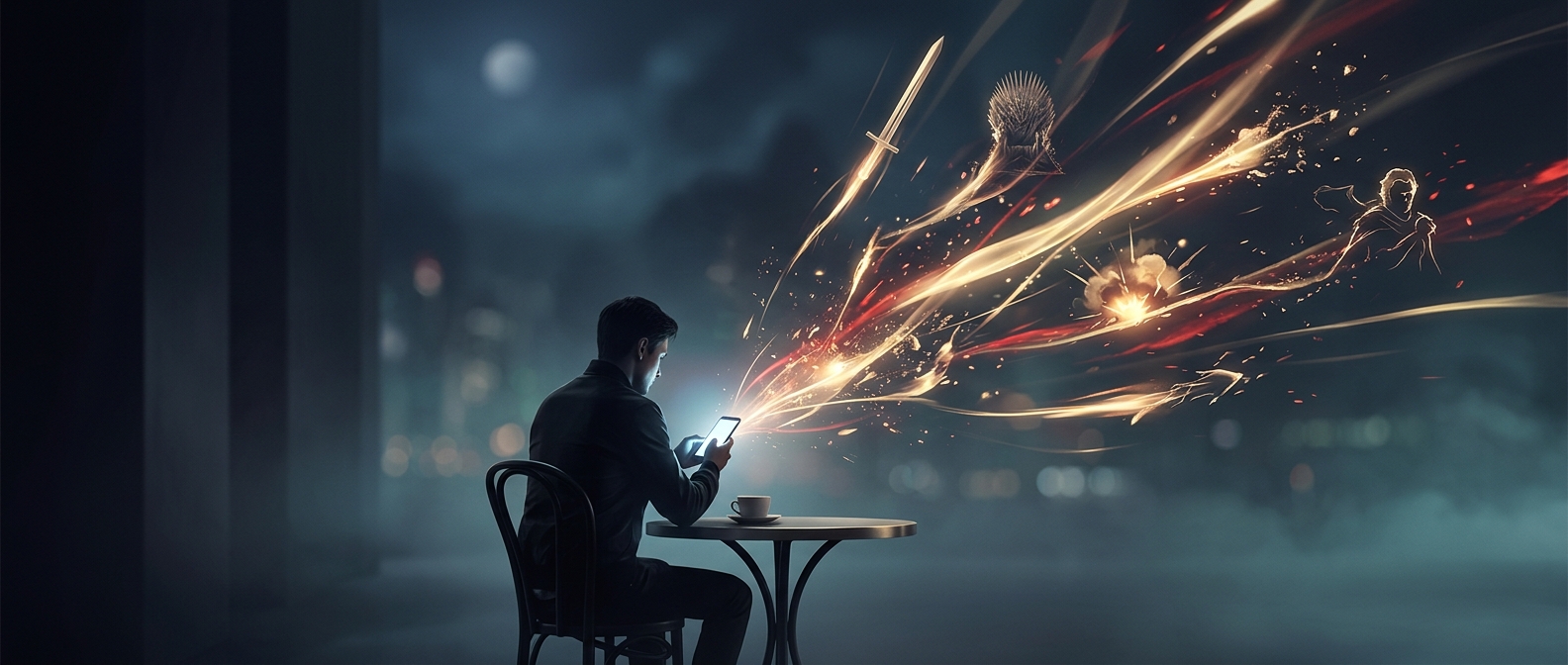
A recommendation system estimates what a viewer might want to watch from patterns in their activity, such as which kinds of titles they have watched. Artwork gives that system another way to present a recommendation: the show stays the same, but the visual emphasis can change. The service can also compare how different artwork performs, using viewer responses to help determine which image is more effective in a given context.
That makes a thumbnail more than decoration. Faces, expressions, and recognizable genre cues can quickly direct attention, before a viewer has consciously weighed the options. But a click is not proof that someone was tricked; it is one observable response among many, and an image cannot guarantee that a viewer will enjoy the show.
The tradeoff behind the poster
This approach treats artwork as part of the viewing experience as well as a marketing tool. A romance-leaning image can make a genre-blending series feel approachable to one person, while a frightening image can foreground its horror for another. The consequence is subtle but real: before the first scene begins, viewers may already have been shown different versions of what the same show is about.