How Big Bird’s design softened his enormous size
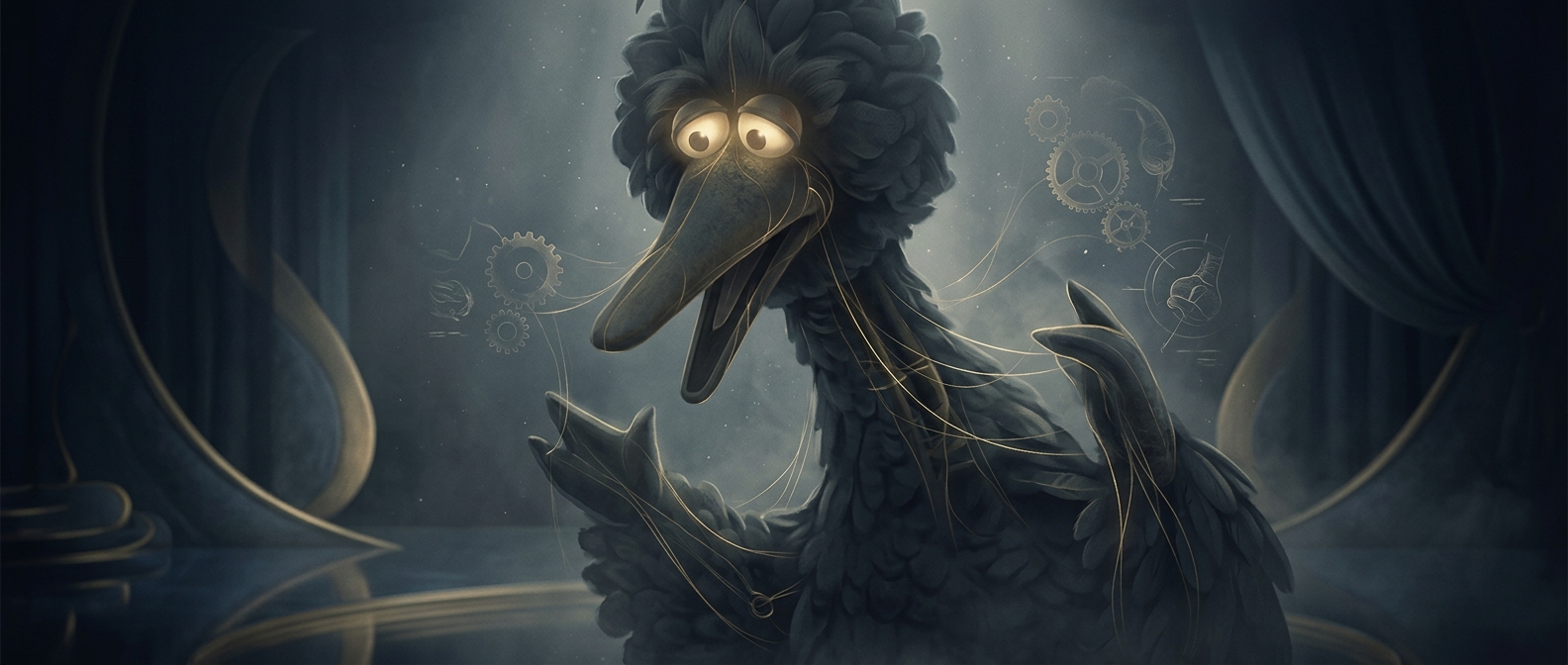
A character towering over a child can feel intimidating before he says a word. Big Bird’s design counters that first impression with familiar signals of harmlessness: a head that angles down, limbs that move loosely, and a walk that looks awkward rather than controlled. Together, those choices make his size read as something unusual about his body—not a sign that he is powerful or menacing.
A posture that invites, rather than looms
The downward tilt matters because it changes the apparent relationship between the character and the children around him. Instead of holding his head high and looking down from above, Big Bird seems to lean into their level. His waddling gait reinforces that impression: he appears to be figuring out where his feet are going, not striding with purpose toward anyone.
That contrast lets the character be physically imposing without acting imposing. Young viewers can notice that he is much bigger than they are while still reading his movements as gentle and a little silly. The design does not hide his height; it gives that height a safe personality.
Building reassurance into the costume
Jim Henson and Kermit Love put those cues into the character’s basic silhouette and movement, so the reassurance did not depend only on dialogue or a particular scene. The loose limbs and tilted head made clumsiness visible even from a distance. For a young child meeting a towering figure on screen, that visual message could arrive before any explanation: Big Bird might be huge, but he does not seem likely to charge, grab, or threaten.