A Few Pixels Left Room for Two Animals
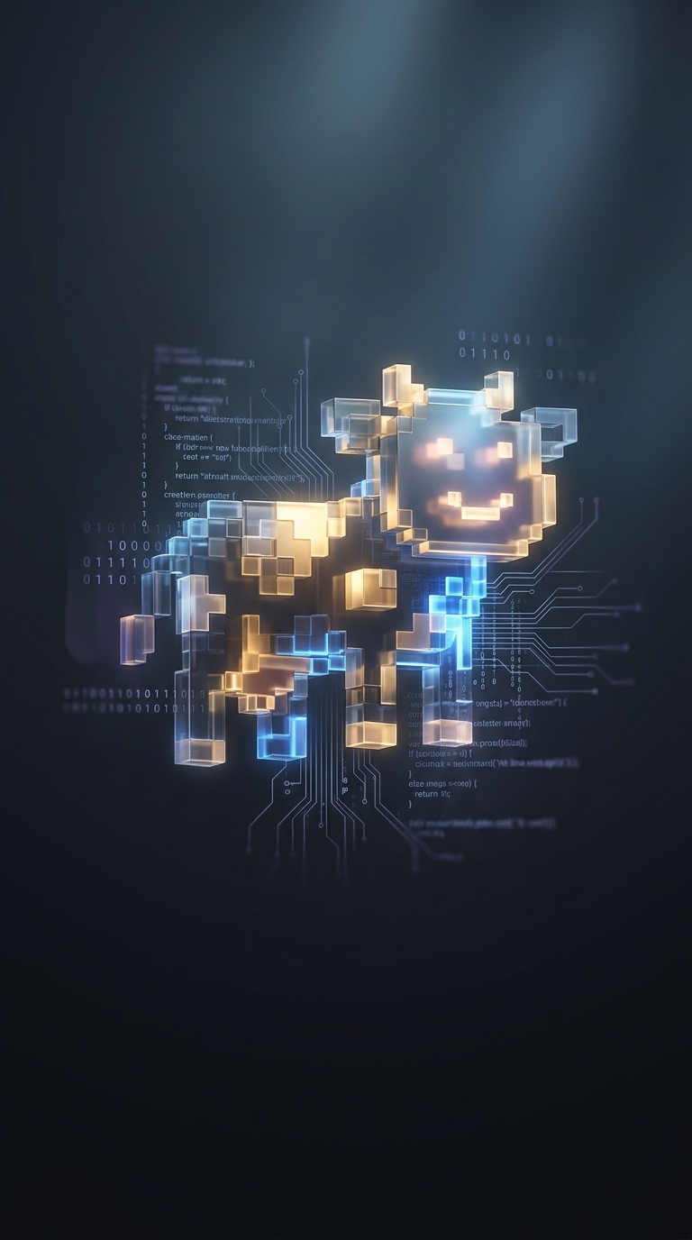
Susan Kare’s original Macintosh icon had to communicate through a tiny grid of black-and-white pixels. At that scale, a silhouette could suggest a dog without clearly settling the question: some viewers saw a small cow instead. The ambiguity was not a hidden technical feature. It was a side effect of making a recognizable, characterful image with very few squares to work with.
That constraint also gave the icon its staying power. Rather than redraw it into an unmistakable dog or cow, Apple adopted the mixed reading and named the creature Clarus the Dogcow. Its signature “Moof” made the joke feel like a character’s trait, not just a debate over what the pixels showed.
From Icon to Macintosh In-Joke
Naming Clarus turned a minor visual uncertainty into a bit of shared computer culture. The creature could be recognized, discussed and reused without needing a precise answer to whether it was a dog or a cow. That playful ambiguity fit early Macintosh icon design, where small pictures had to carry meaning quickly while also giving the interface personality.
The lasting point is how little was needed to make the image memorable: a compact silhouette, two plausible interpretations and one invented sound. Clarus’s identity depended on not resolving the argument—and “Moof” gave users a word for the creature either way.