When a Fictional Map Reached the Newsroom
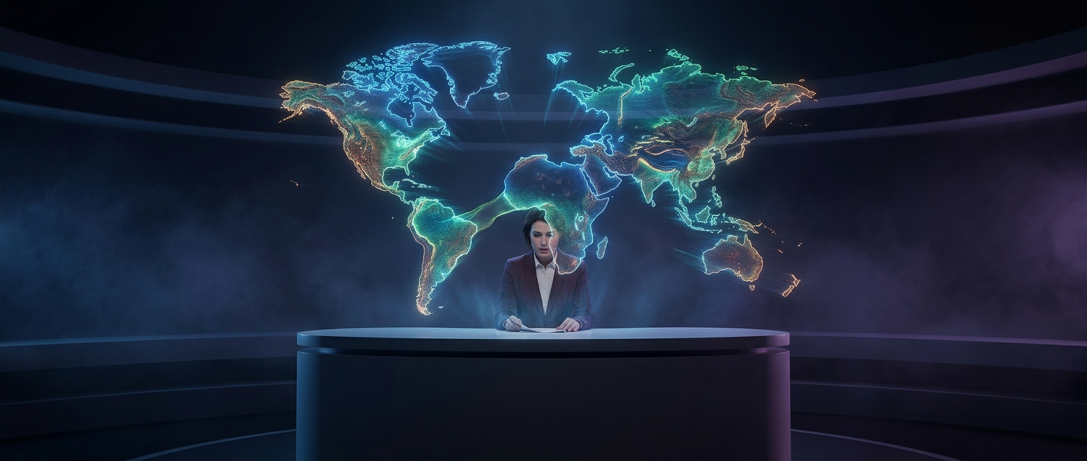
A map on a news broadcast carries an implied promise: the outlines and labels correspond to real places. That makes a fictional map especially jarring in a segment about real events. Viewers are asked to follow a serious explanation, but the image points toward a geography that does not exist.
How a Graphic Can Mislead
Broadcast maps are visual aids, not just decoration. They help viewers locate borders, routes, and regions while a presenter speaks. If the wrong map graphic is selected or placed into a segment, its polished appearance can make the mistake harder to spot at a glance. Viewers may assume the map is an unfamiliar real-world rendering rather than a fictional one—and then struggle to reconcile it with what the report says.
The incident shows why a graphic’s accuracy matters as much as its narration. In a fast-moving geopolitical story, a map is part of the explanation; one mismatched image can leave viewers questioning the geography instead of following the news.