The green bubble turns a technical difference into a social signal
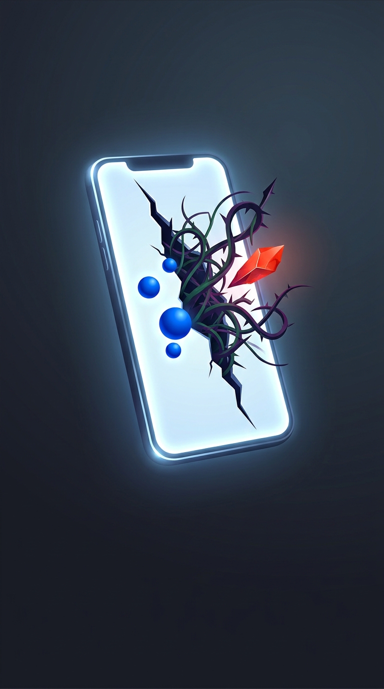
On an iPhone, blue bubbles indicate messages sent through Apple’s iMessage service; green bubbles indicate messages sent by another route, such as standard texting. The color is useful shorthand—but it also makes the sender’s device ecosystem visible in the middle of an ordinary conversation.
That is the subtle design choice: a compatibility difference becomes a repeated visual label attached to a person. Every time a conversation switches to green, the interface calls attention to the fact that one participant is outside the iMessage group. No warning or insult is needed; the color does the sorting.
When the label comes with friction
The distinction can feel more consequential because the two routes have not always offered the same features. Depending on the devices and software involved, a green-bubble conversation may lack some iMessage conveniences, or handle things such as group chats and media differently. A user may experience the result as a clumsy conversation, then associate that inconvenience with the person whose messages appear green.
This is a feedback loop: the color marks the technical mismatch, and any resulting annoyance reinforces the social meaning of the color. In a group chat, the difference is especially conspicuous because one person’s messages can look unlike everyone else’s.
The bubble color does not reveal anything about someone’s character, and it does not mean they chose to make a conversation harder. But a tiny interface cue can still shape how a message feels. What looks like a simple status indicator can quietly turn a software boundary into a social one.