
A closer look
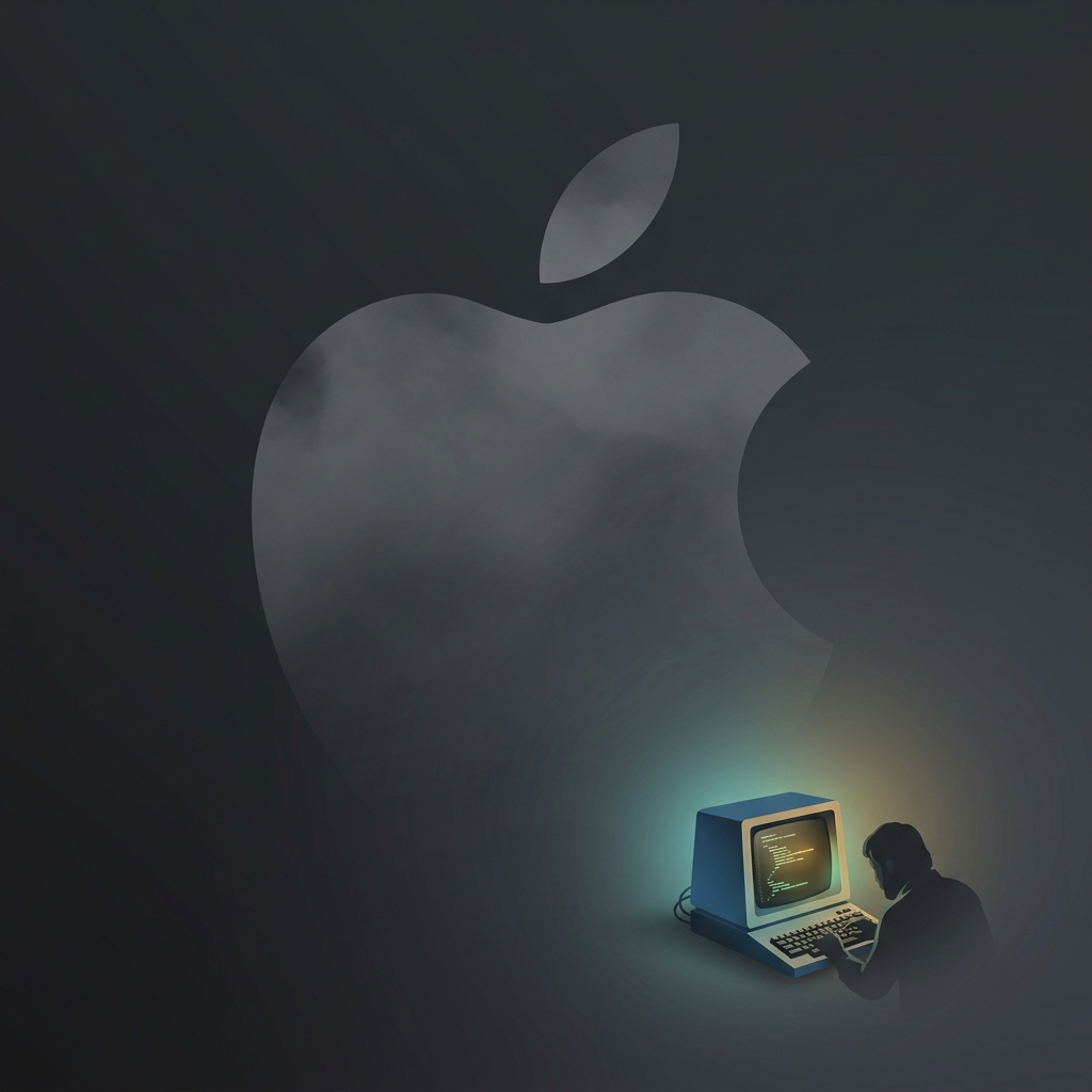
Ronald Wayne designed the very first Apple logo in 1976 as a complicated ink illustration depicting Sir Isaac Newton sitting under a tree with a glowing apple dangling precariously above his head. Steve Jobs quickly realized this wildly overly intricate, Victorian-style drawing looked absolutely terrible when shrunk down on a piece of hardware and demanded a simpler, modern redesign within a year. It is hilarious to think that the multi-trillion dollar company famous for its relentless obsession with sleek, minimalist design and brushed aluminum started out with corporate branding that looked like a woodcut from an antique textbook. Wayne ended up selling his ten percent stake in the company for just eight hundred dollars a few days later, securing his place in history as the man who designed a terrible logo and then immediately fumbled what would have been a seventy billion dollar fortune