Why the First Screen Can Be Brighter Than the App
A launch screen appears while an app is opening, before its full interface is ready. It may be a logo or a plain background, but it often comes from a simpler layer than the app itself: a screen the operating system can show immediately while the app loads its code and prepares its settings.
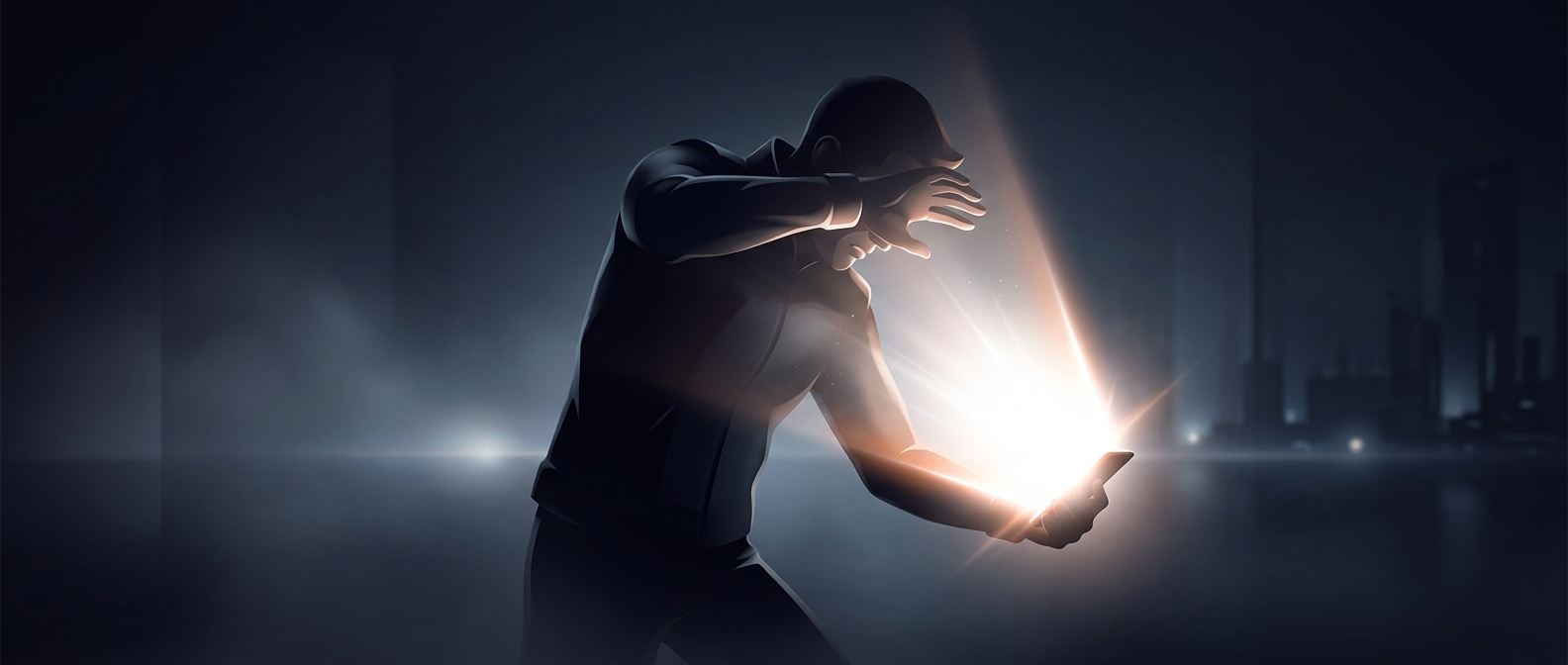
That timing can create a jarring mismatch. The finished app may use a dark theme, yet the launch screen can still be white if it was designed separately or appears before the app has read the device’s appearance settings. A brief flash of the wrong theme is especially noticeable when the screen is the first bright object in a dark room.
The Tradeoff Between Speed and Continuity
A launch screen has a practical job: it gives the user immediate feedback that the app is opening instead of leaving a blank or frozen-looking display. Keeping that screen simple can make it quick to show. Matching it to every possible theme, however, requires the app to handle the device’s settings early and provide the right version of the screen.
The same design choice affects perceived brightness. In darkness, a broad white area can feel startling even at a brightness level that seemed comfortable moments earlier; the contrast with the surroundings is doing much of the work. As soon as the app’s darker interface replaces the launch screen, the glare disappears—but the transition has already made its impression.