Why a World Map Can Mislead a European Itinerary
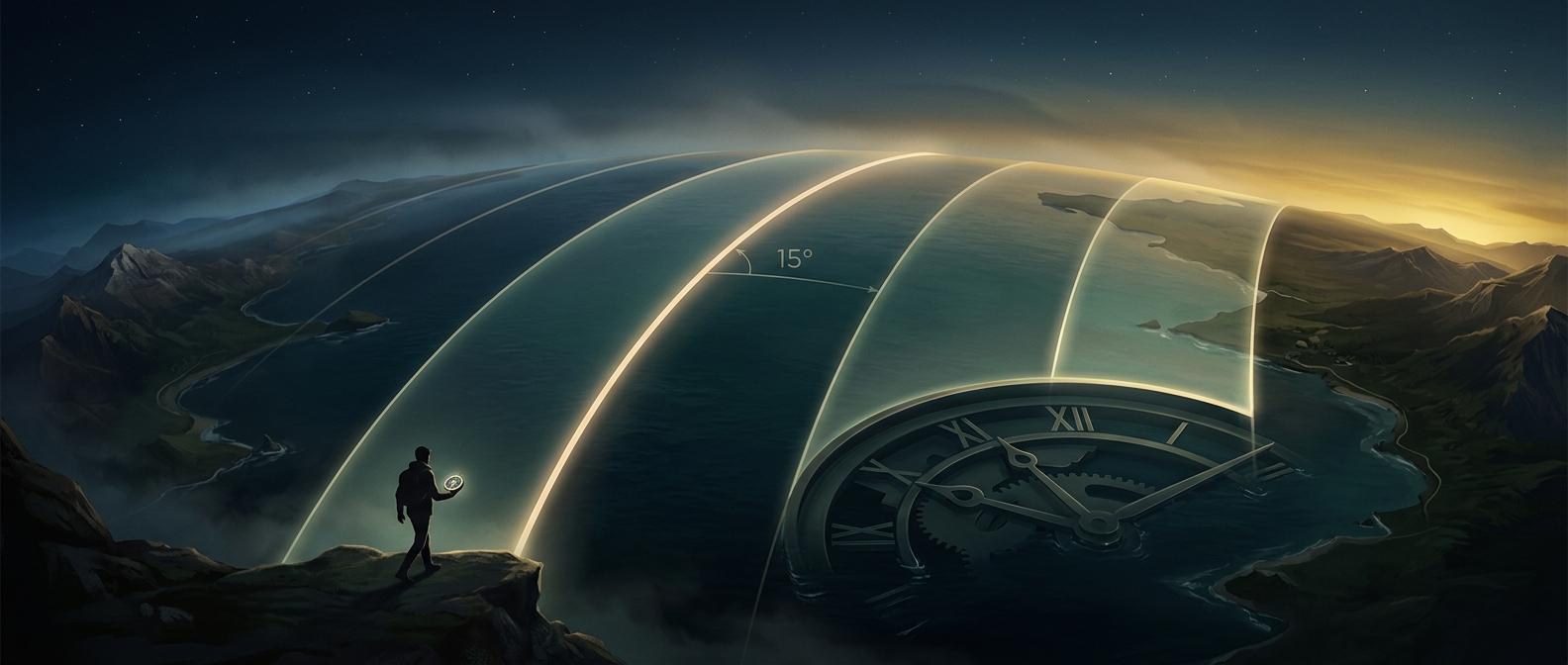
The familiar rectangular world map is often drawn using the Mercator projection, a method that turns a round Earth into a flat image while preserving local angles and shapes. Its tradeoff is scale: the farther a place is from the equator, the larger it appears. Europe is shown substantially enlarged compared with equatorial regions, and distances on the map are not reliable measures of distances on the ground.
That can distort a first pass at vacation planning. A traveler looking at a world map may misjudge how far apart destinations are, or assume that the apparent spacing between cities tells them how long a train or car trip will take. The projection can also make north–south comparisons especially deceptive: its scale changes with latitude, so equal-looking stretches on the page do not necessarily represent equal stretches of Earth.
A Flat Map Is Not a Travel-Time Map
Even a more accurate distance estimate would not settle an itinerary. A short straight-line gap can involve slow connections, mountain crossings, or indirect routes; a longer gap may be covered quickly by a direct train or flight. Travel time depends on transport networks and schedules, not just geography.
For planning, use a regional map with a distance scale, then check actual route times between stops. Treat the world map as an overview of where places sit—not as a ruler. That small switch can prevent a vacation plan from being built around distances the flat page only seems to show.