How a Letter Became a Warning
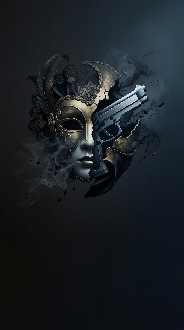
The Sopranos logo makes its subject legible before a viewer knows anything about the story. The word “Sopranos” can suggest opera singers; replacing part of the R with a handgun pushes the title toward organized crime instead. The image works as a visual pun, but also as a compact genre signal: this is a family drama with violence built into its world.
Why the Detail Matters
A title card has only a moment to set expectations. A minimalist wordmark might preserve the ambiguity of the name, while the gun resolves it immediately. Integrating the weapon into a letter makes that clarification feel like part of the title rather than a separate illustration or warning label.
That choice also captures the show’s central tension. The characters inhabit ordinary settings—homes, restaurants, family gatherings—but violence is never far away. The logo compresses that contrast into a single mark: a familiar word altered by a weapon.
The result is more than a label for a crime series. It gives viewers a small preview of the show’s visual logic, where domestic life and criminal power occupy the same frame.