Why a tiny square means “save”
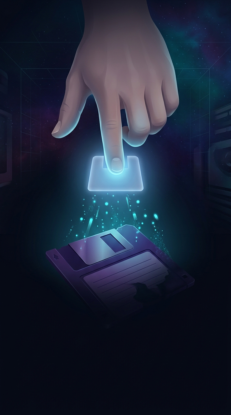
The floppy-disk icon is a visual metaphor: it borrows the appearance of an object people once used to store computer files and applies it to a command that now saves them very differently. On a 3.5-inch floppy disk, a sliding metal shutter covered the exposed surface that a drive read and wrote. The square shape and shutter made the object easy to recognize in early software interfaces.
When computers moved from removable disks to hard drives, then to networked and cloud storage, the command stayed familiar even as the machinery changed. Clicking “save” may now update a file on a solid-state drive or send changes to a remote server; the icon no longer describes the process. It identifies the action by inheritance.
A metaphor becomes part of the interface
Early computer designers often used images of familiar objects to make abstract operations easier to understand. This approach is sometimes called skeuomorphism: a digital control borrows the look or behavior of a physical one. The point is not that the screen contains a disk, but that users can learn what the symbol does without reading an explanation.
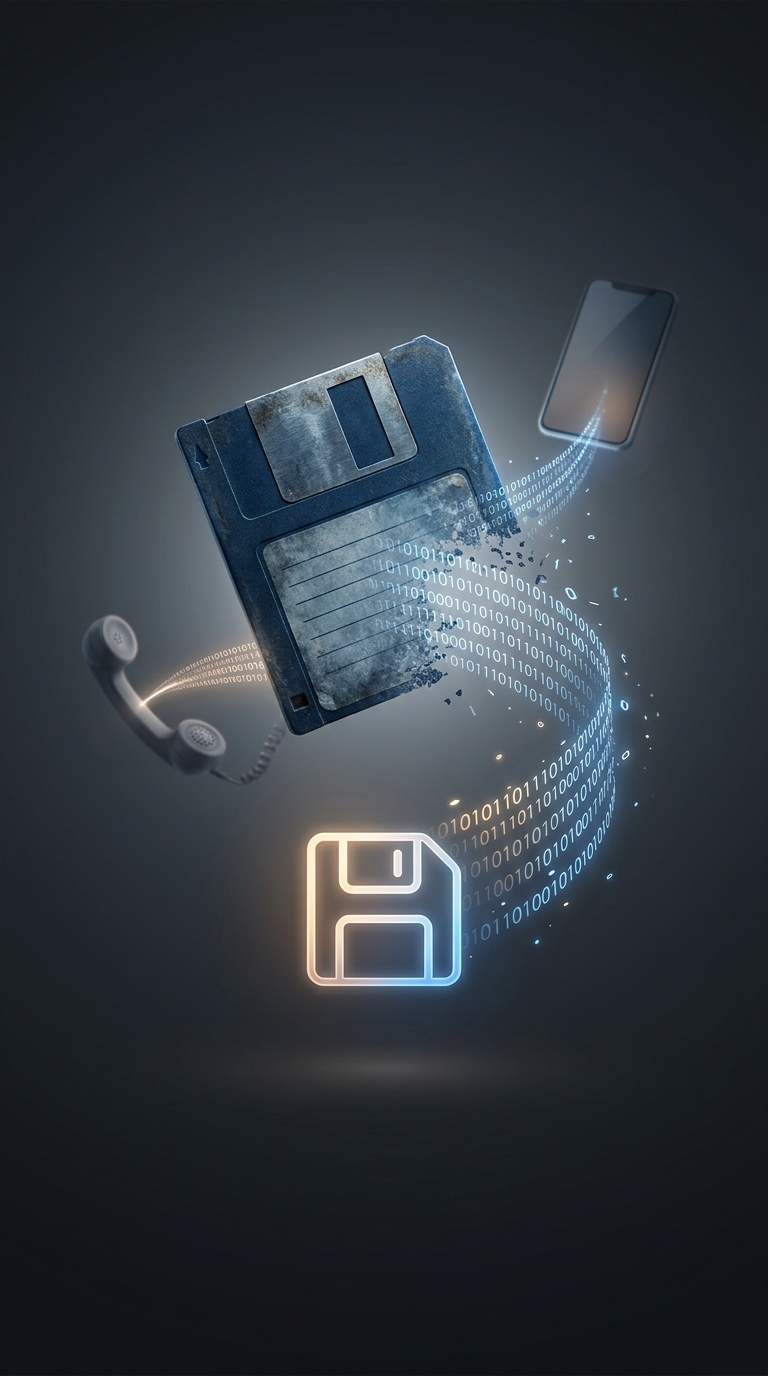
Once an icon becomes a convention, replacing it can create more confusion than keeping it. A younger user may not recognize the object, yet can still learn that clicking it preserves work. Software interfaces are full of such hand-me-down symbols: a handset can mean answering a call even when the phone has no moving parts.
The object fades; the meaning survives
That gap between image and object is a small record of technological change. The icon began as a picture of a practical storage device and outlived the device’s everyday role because generations of software kept teaching the same association. A person can use “save” for years without ever knowing what the symbol depicts—which is exactly how a once-literal picture becomes a piece of interface language.