Why unsubscribe links fade into the background
An email or website often has a preferred action: buy, renew, sign up, or keep receiving messages. Designers make that action easy to spot with larger type, stronger color, and a prominent button. An unsubscribe link competes for attention, so it may be placed in a footer and styled in small, pale text.
That visual hierarchy works because people scan rather than read every line. A link can remain technically present while becoming much harder to notice or use. This is especially effective on a phone, where small text takes up little space and may be harder to distinguish from the background.
When design becomes friction
Not every faint link is proof of deliberate manipulation. A crowded template, inherited branding, or an effort to keep footers visually quiet can produce the same result. But when a company benefits from keeping subscribers, making the exit less visible adds friction: people may give up, overlook the link, or choose another action that keeps them on the mailing list.
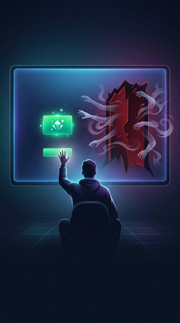
The same pattern can appear in account settings and subscription screens. A bright “Keep my plan” button beside a low-contrast cancellation option steers attention without removing the cancellation route altogether. That distinction matters: the choice exists, but the interface makes one path easier to find.
The practical cost
Low contrast also creates an accessibility problem. Readers with low vision may be unable to read a pale link even when they know where to look. A clear unsubscribe option reduces effort for everyone and can prevent unwanted messages from accumulating—or being marked as spam instead. The small design choice therefore affects more than appearance: it determines whether leaving is a straightforward action or a search.