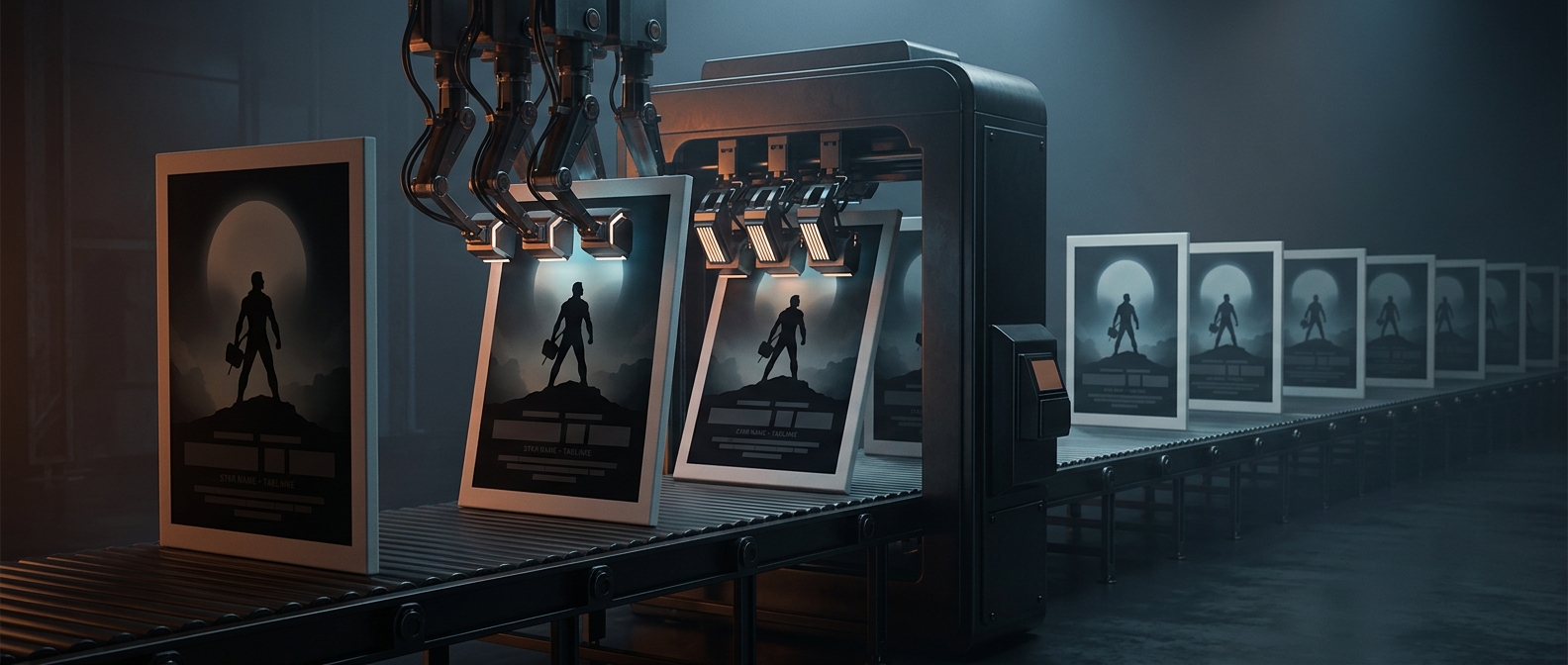
A poster has seconds to set expectations
A movie poster is both an advertisement and a promise. Before someone reads a title or recognizes an actor, color, composition, and familiar imagery can suggest whether the film is a romance, thriller, comedy, or action movie. Reusing visual patterns makes that message quick to read: a looming face can imply danger or authority, while a hero looking back over a shoulder hints at pursuit, conflict, or a world just beyond the frame.
Familiar designs lower the risk of being misunderstood
Studios and designers work with limited space and a crowded market. A poster must stand out, but it also needs to reach people who may know little about the film. Genre conventions act like a visual shorthand: audiences have learned to associate certain moods, poses, and arrangements with certain kinds of stories. A design that departs too far from those cues might be striking yet fail to attract the intended audience—or suggest the wrong kind of movie.
That makes poster design a balancing act. The creative team can distinguish a film through its particular actors, setting, palette, or central image while keeping enough familiar signals for viewers to place it. Similar layouts are not necessarily evidence of a lack of imagination; they can reflect the practical job the poster is meant to do.
The pattern is part of the pitch
A viewer who spots a recognizable genre image can decide, at a glance, whether the movie seems worth a closer look. The tradeoff is that repeated visual shorthand can make different films blur together. But that sameness also shows how much a poster is designed around the viewer’s expectations: it has to sell the individual story while first making clear what sort of experience is on offer.