A few pixels had to do the work of a face
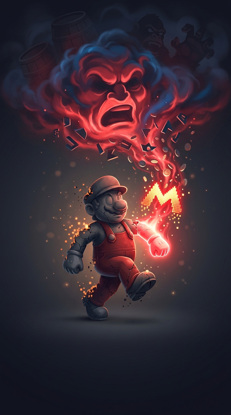
When Mario first appeared as Jumpman in Donkey Kong (1981), arcade hardware could show only a tiny, blocky character. At that scale, drawing a natural-looking face was less useful than making the few visible features unmistakable.
A thick mustache gave the face a strong dark line, separating the nose from the rest of the head. A hat provided a clear outline and meant the designers did not have to depict hair in small, shifting pixels as the character moved. These details turned a handful of colored squares into a face players could recognize at a glance.
The outfit made movement readable
The same practical thinking shaped Mario’s clothes. Overalls contrasted with his shirt, helping his arms stand out against his body when he ran and jumped. The goal was not just to make a charming character; it was to make the character’s position and movement legible on a crowded, low-resolution screen.
Those solutions became part of Mario’s identity. What began as a way to make a tiny sprite readable proved distinctive enough to survive long after screens could show much more detail.