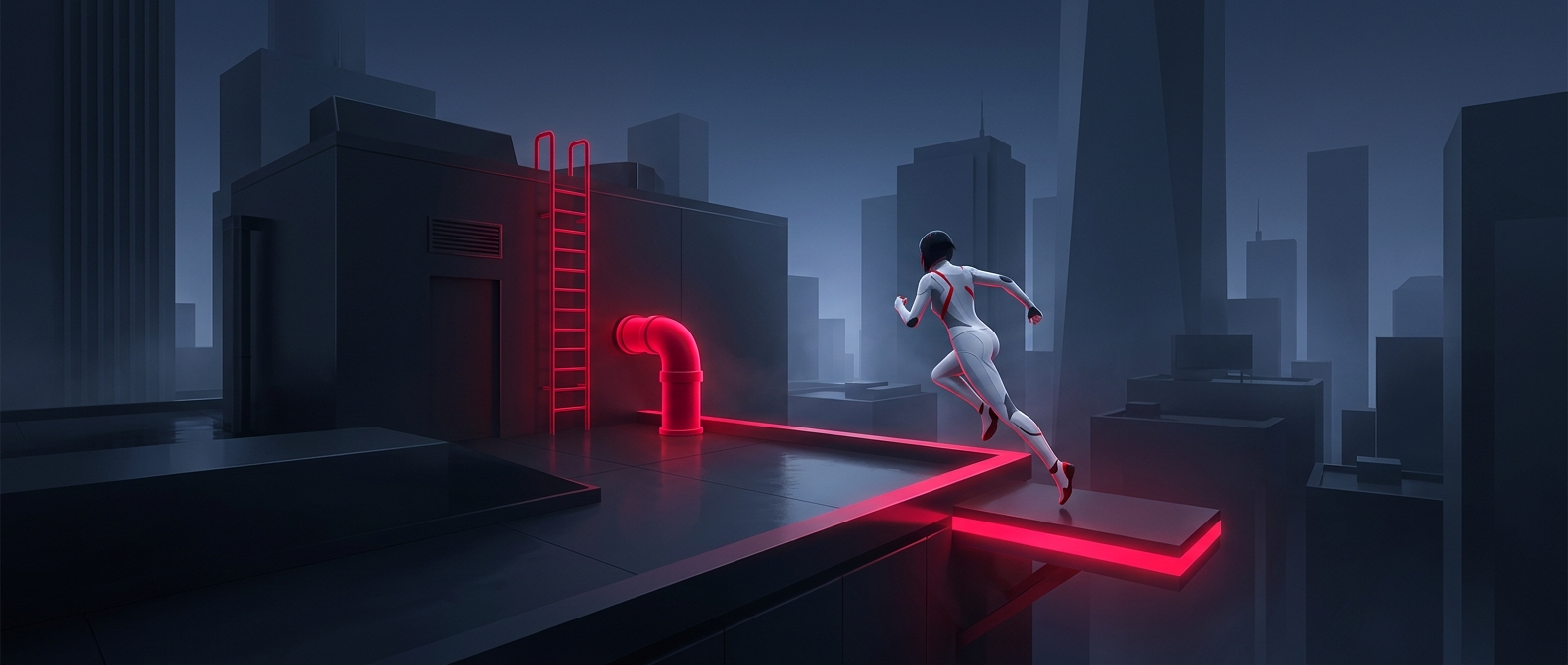
A Color That Turns the City Into a Route
In Mirror’s Edge, the rooftops are not just scenery: they are a sequence of decisions the player must make while running. A ledge, pipe, or door matters only if it can carry the character toward the next stretch of ground. Marking useful objects in red gives those possibilities a shared visual language, so players can read the environment at a glance instead of treating every rooftop detail as equally important.
That matters because the game’s movement depends on timing. A runner who pauses to inspect the surroundings loses speed, and a missed turn can break the flow of a chase. The color cue helps players spot the next likely move while still approaching it at a run. It does not perform the jump for them; they still have to judge distance, angle, and timing.
Why the Marking Fits the Art Direction
The cue works partly because the game keeps much of its city visually restrained. Against pale surfaces and comparatively limited color, red stands out without needing a blinking arrow or a permanent map overlay. The same architectural object can therefore serve two roles: it belongs to the fictional city, but its color also communicates how the level can be traversed.
That is a deliberate compromise between openness and guidance. Players can feel as if they are finding their own way across a real urban landscape, while the designers quietly make the intended chain of movements easier to recognize. The result is a navigation system built into the scenery: the city itself tells you where momentum can go next.