Why the title feels like a printed object
The Stranger Things title does more than identify the show: it makes the words feel as if they belong on a well-worn paperback. ITC Benguiat’s thick, high-contrast letters have distinctive curves and flared details, giving the title a handcrafted presence that a plain modern sans serif would not. The typeface carries much of the period signal before the viewer has seen a setting or a costume.
Familiarity comes from the treatment, too
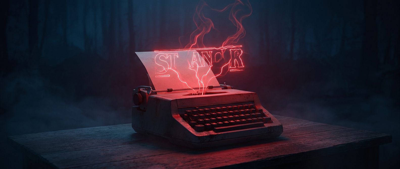
The lettering is presented in glowing red against darkness, with the words appearing gradually rather than arriving as a static label. That combination turns a printed-looking design into an ominous screen image. The warmth of the old-fashioned letterforms suggests familiar pop culture; the stark color and slow reveal make that familiarity uneasy.
This is a useful distinction: a typeface alone cannot recreate an era. Its effect depends on what surrounds it—color, pacing, contrast, and the visual references audiences bring with them. Here, a recognizable style helps establish both the show’s period setting and its mix of childhood adventure and lurking danger.
A shortcut with a double meaning
Because viewers may already associate this kind of lettering with older genre books, the title can evoke a whole shelf of stories in a few seconds. But it does not simply promise a replica of the past. The familiar design is also a warning: the show is inviting viewers into an old-fashioned adventure while preparing to twist it into something frightening.