How Pet Food Became a Wellness Purchase
The packaging shift reflects premiumization: brands try to move shoppers from treating dog food as a basic household staple to buying it as a product tied to health and care. When owners see pets as family members, they may apply familiar standards from their own grocery shopping—scrutinizing ingredients, seeking recognizable foods, and paying more for products that feel carefully made.
That creates an economic incentive to borrow the visual language of human wellness food. Clean layouts, restrained colors, ingredient illustrations, and words such as “natural” or “whole” can signal quality before a shopper has read the label. The design is not just decoration; it helps a higher-priced bag look distinct from a commodity product and gives shoppers a quick way to navigate a crowded shelf.
Why So Many Bags Converge on the Same Look
The cues are easy to recognize, but that also makes them easy for competitors to imitate. If a minimalist design suggests purity or expertise, rival brands have reason to adopt similar choices. Retail shelves amplify the effect: packages must communicate quickly at a distance, so companies often rely on a familiar set of high-contrast claims, ingredient imagery, and uncluttered typography.
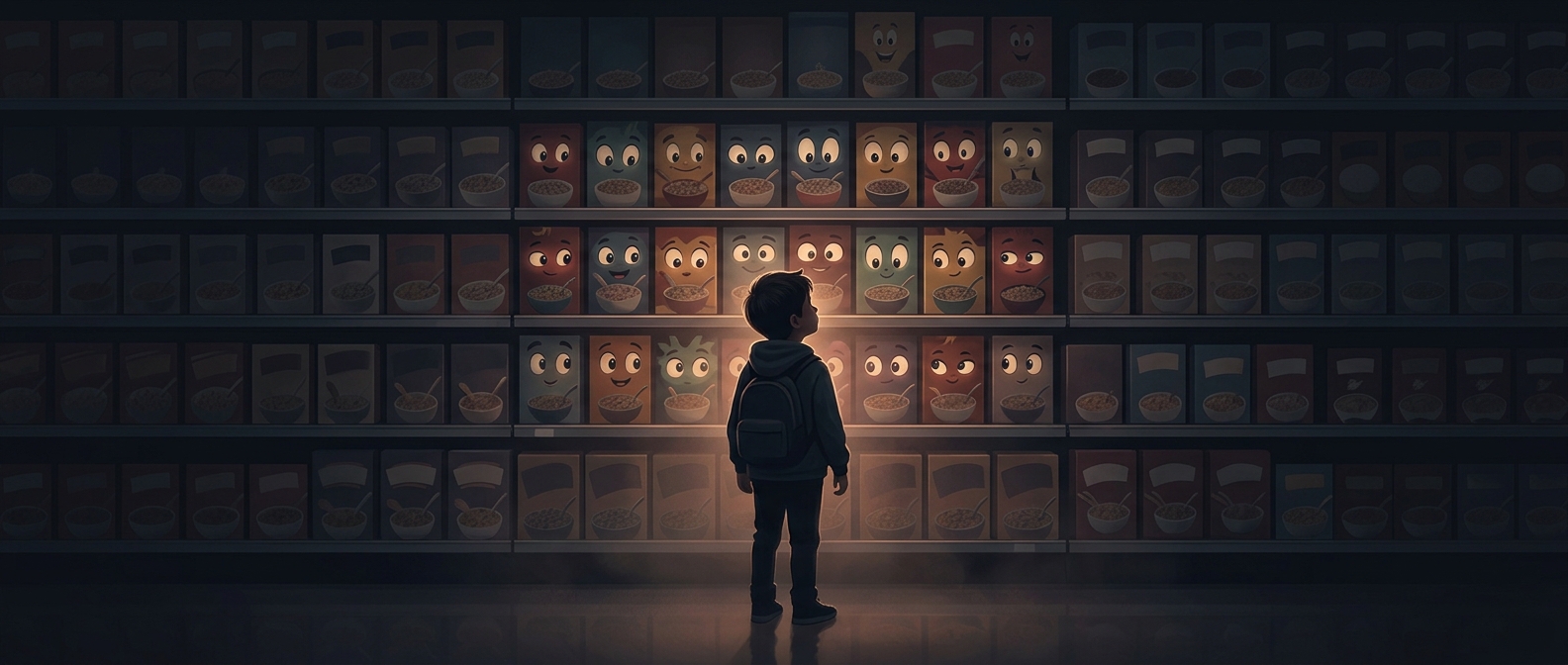
The result is a visual arms race with a paradoxical outcome: brands use similar signals to argue that their products are more distinctive. For shoppers, the practical implication is that packaging can reveal how a company wants its food perceived, but it cannot by itself establish what is in the bag. The closer pet food gets to the premium wellness market, the more its design sells a promise—and the more important it becomes to check the ingredient list behind that promise.