Economy
Why cash uses strange serial-number fonts
HERE’S THE INTERESTING PART
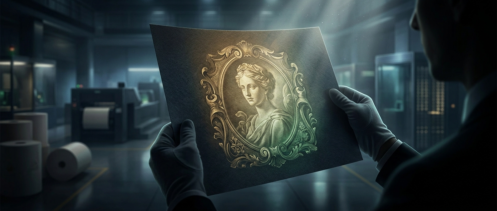
If you try matching the font of the serial numbers on your cash using standard word processors, you will fail instantly. The typography is entirely proprietary, utilizing bizarrely shaped numbers with intentionally varied spacing. It is a highly specific, closely guarded typographic nightmare designed exclusively to spot amateurs who think they can just hit print on a laserjet.
One discovery leads to another.
Keep exploring facts in this topic.
Economy →