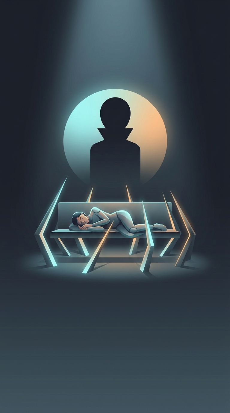
Why appearance changes the verdict
When software looks polished, people often approach it expecting it to work well. That expectation can shape how they interpret what happens next: a confusing screen or brief failure may seem like an exception rather than evidence that the whole product is unreliable. The visual design has not fixed the problem; it has changed the lens through which the problem is judged.
This is part of the aesthetic-usability effect: people tend to perceive attractive designs as easier to use, even when appearance and actual usability are separate. A clear visual hierarchy, balanced spacing, and consistent controls can make an interface feel orderly before someone has learned how it works. That first impression can carry over into later judgments.
How a crash gets reinterpreted
After an error, users have to decide what caused it. If the interface otherwise feels coherent, they may blame a mistyped command, a missed button, or a momentary glitch. A rough-looking program offers fewer reassuring cues, so the same failure may be taken as a sign of deeper trouble. Neither reaction proves who or what caused the error; appearance simply influences which explanation feels plausible.
That shift can buy a product patience. Users may try again, explore a workaround, or give the software another chance instead of abandoning it immediately. But the effect has limits: repeated crashes, lost work, or confusing recovery steps eventually provide stronger evidence than a pleasing interface can offset.
Polish is not reliability
The distinction matters for both users and designers. Attractive software can make a first encounter feel smoother, but it cannot substitute for dependable behavior or clear error recovery. When a crash occurs, the most trustworthy interface is not merely the one that looks composed; it is the one that explains what happened and helps users recover without making them wonder whether they caused the failure.