How a Comic Page Controls Reading Speed
A comic does not move at a fixed rate. The reader supplies the time, deciding how long to look at each image and when to move on. The artist can still influence that pace by shaping the route the eye takes across the page—and by deciding how much visual information each stop contains.
Small Panels Create Quick Beats
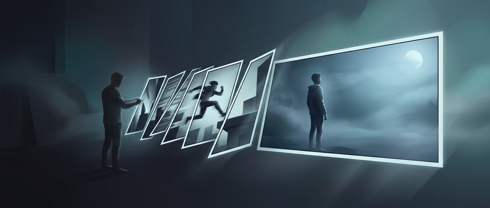
A row of narrow panels can feel like a rapid sequence because each one offers a brief, clearly bounded glimpse: a punch begins, a fist connects, a character recoils. The reader makes several quick transitions in succession, much like following a series of cuts in a film. Jagged borders add visual tension, suggesting impact or disorder, so the sequence can feel more abrupt than a row of calm, evenly shaped frames.
The effect depends on what is drawn, too. A crowded panel may hold the reader’s attention, while a simple image can be understood at a glance. Panel shape is one cue among several, not a stopwatch.
A Large Image Makes a Reader Pause
A full-page image removes the usual chain of small transitions. Instead of moving immediately to the next frame, the reader can scan one scene, notice details, and sit with its emotional weight. The pause is not enforced—the reader can turn the page quickly—but the open space around the image and its scale invite a longer look.
That makes page layout part of the storytelling. A sudden expansion from tight, repeated frames to one large image can feel like a release from rapid action, or make a consequence harder to rush past. The reader’s eyes may cross the page in seconds; the composition can make those seconds feel very different.