Why Animated Food Needs Strong Color
A real pizza gets much of its appeal from subtle differences: browned cheese, glossy sauce, pale dough, and crisp shadows. In a drawing, those small variations can disappear. A limited set of shapes and colors has to suggest texture quickly, often while the food is moving or shown briefly.
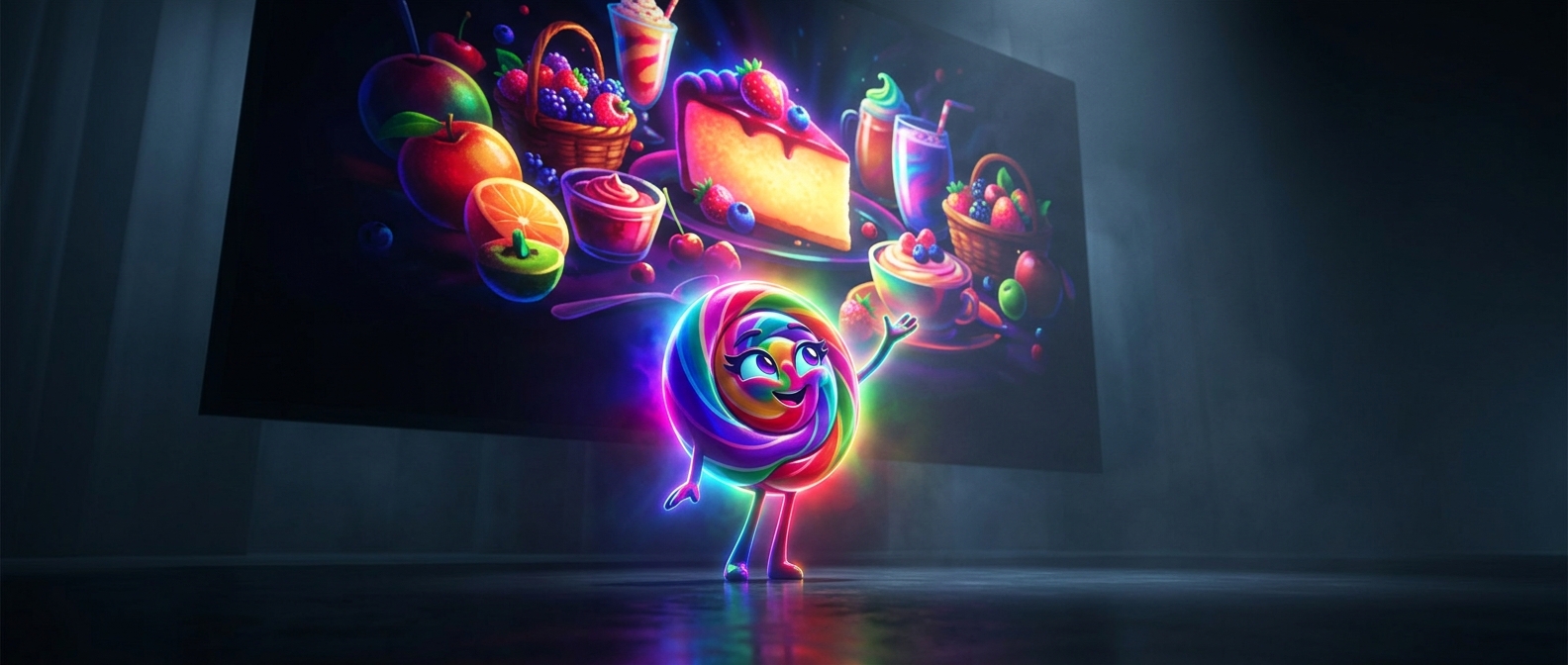
Saturation—the intensity of a color—helps separate ingredients at a glance. A lively tomato red reads as sauce, while warm yellows suggest cheese and a baked crust. If those hues are too muted, they can blend with one another and with nearby browns, making the pizza look flat or indistinct.
Color Has to Work With the Drawing
Color alone does not make food look edible. Artists also use highlights to imply oil or melted cheese, darker edges to suggest browning, and shapes that make toppings easy to recognize. The palette reinforces those cues: contrast keeps a pepperoni slice distinct from the cheese beneath it, for example.
The choices are especially useful in animation, where a viewer may have only a moment to read a meal before the scene moves on. Strong, separated colors preserve that quick recognition across different poses and backgrounds. The goal is not simply to make the food bright; it is to make its ingredients and texture legible before the image has passed.