Purple Made the Apartment Impossible to Confuse
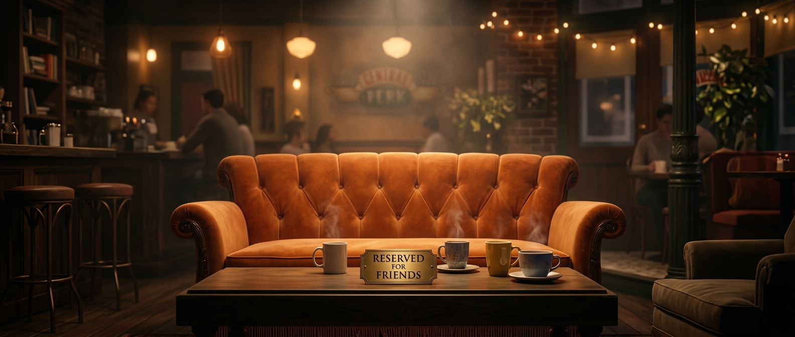
Monica’s apartment needed to register instantly. Friends returned to the same few interiors episode after episode, and the apartment was often shown in wide shots, with several characters moving through the room at once. A pale, conventional wall color might have made the set feel naturalistic, but it would have given viewers little to remember. Purple turned the room itself into a visual landmark.
A Set Built to Read on Camera
A sitcom set is designed for an audience watching through a camera, not for someone casually passing through a real home. The walls, furniture, and doorways have to remain legible under studio lighting and across repeated shots. A saturated color helps define the space in a glance and gives the actors a clear visual backdrop without requiring the camera to explain where the scene is happening.
The choice also helped Friends distinguish its interiors. Monica’s apartment felt playful and heightened, while still serving as a familiar gathering place. Its bold walls made the room feel like part of the show’s visual identity rather than an interchangeable apartment set.
The Color Became Part of the Story’s Memory
Because the characters spent so much time there, viewers learned the apartment as a place: the purple walls, the opposing living rooms, and the door between them became recurring landmarks. The color’s practical design advantage—instant recognition—turned into an emotional one. A single glance at that shade could tell viewers they were back in the group’s home base.