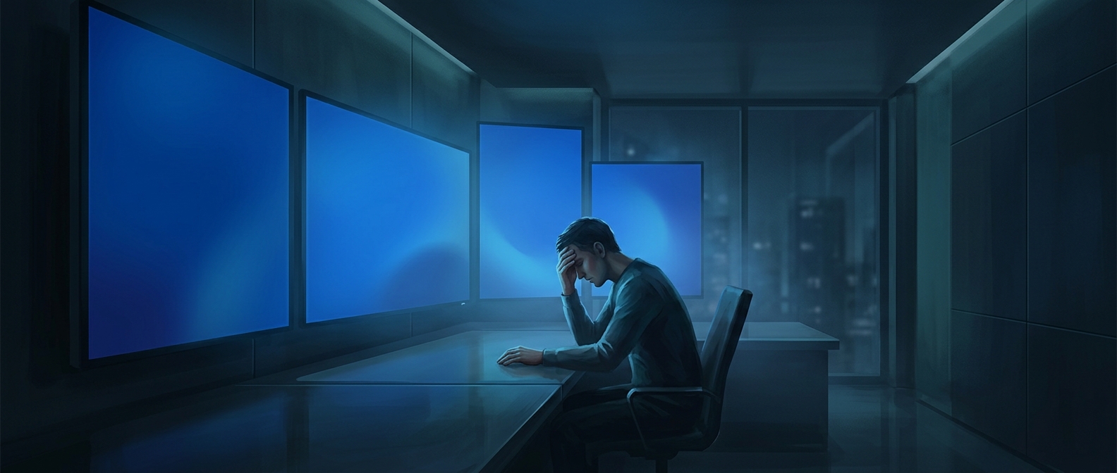
A calm color for a crisis
A blue screen of death appears when Windows encounters a serious system error and cannot safely continue. Because the computer may no longer be able to run its normal interface, the error message takes over the display. The color is part of that emergency presentation: early developers favored blue as a background they thought would be soothing to read, even while the message delivered bad news.
Why the choice feels so stark
A full-screen error has to do two jobs at once: signal that ordinary work has stopped and show information about what went wrong. Blue offers a broad, relatively uncluttered field for pale text, while its uniformity makes clear that this is not another window or alert that can simply be dismissed.
But the design cannot control the circumstances in which people see it. A sudden crash interrupts whatever they were doing, and the loss of control is alarming regardless of the background color. The blue was meant to soften the reading experience, not make a system failure feel harmless. That contrast—calm color, serious message—is what makes the screen so memorable.