How a Small Shift Becomes Part of the Design
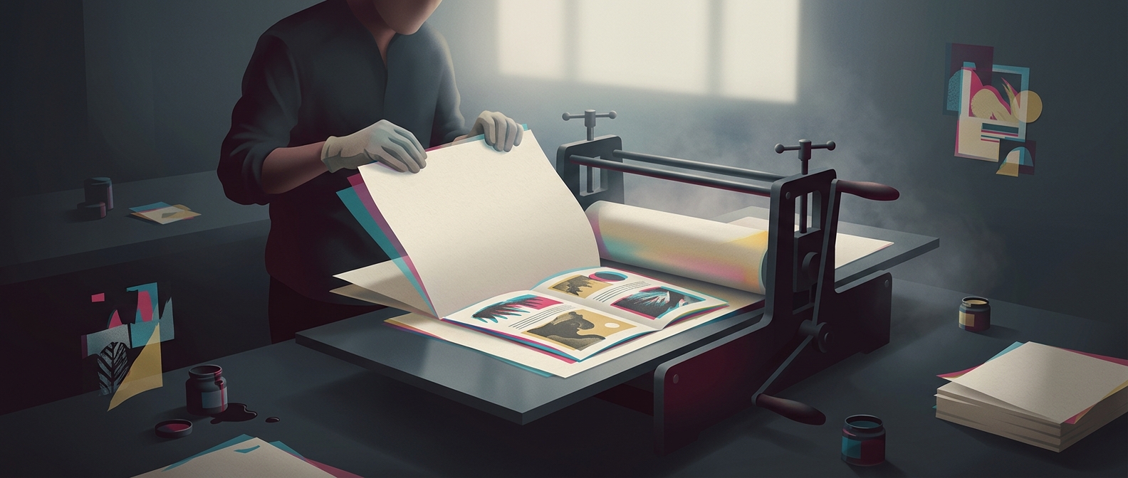
A Risograph print is built one ink color at a time. For each pass, the machine makes a stencil, lays ink through it onto the paper, then repeats the process with a new stencil for the next color. Because the sheet has to be fed through again, the layers may not land in exactly the same position. That slight mismatch is called misregistration.
In a conventional print job, misregistration is usually treated as an error: outlines look fuzzy, and shapes no longer line up. Zine makers can turn the same effect into a visual tool. They may place color shapes so their edges nearly meet, letting a small shift produce a bright fringe, or let two inks overlap to create a third color.
Designing With the Machine’s Limits
The effect depends on restraint as much as chance. A shift that is too large can make text hard to read or obscure an illustration. Designers often keep type and essential details aligned while giving larger shapes, backgrounds, or decorative elements room to drift. They can also build the offset into the artwork itself, so the print’s imperfect alignment feels deliberate rather than accidental.
That approach suits zines, which are often made in small runs and value a direct, handmade look. The layered process leaves visible traces of how the image was assembled: a colored edge can show where one pass ends and another begins. Instead of hiding every variation, the maker lets the printing process become part of the page’s style.