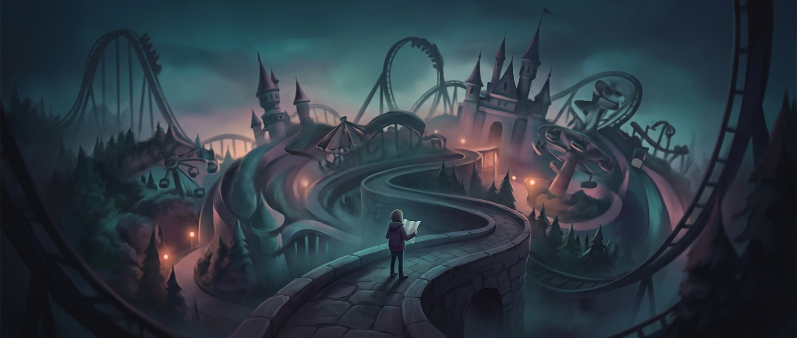
Why Theme Park Maps Compress the Walk
A theme park map has two jobs that can conflict: show where things are and help visitors choose what to do next. A geographically exact map might leave large blank stretches between attractions, while squeezing the park into a page or phone screen can make labels and paths hard to read. Designers therefore simplify the layout, enlarging important areas and compressing some distances.
That makes the map a visitor guide, not a reliable measuring tool. Two attractions drawn close together may still be separated by a long path, a switchback queue, or a route around water or buildings. The drawing preserves the order and general direction of places better than their true scale.
The Walk Feels Shorter Than It Is
When a major ride, a show, and a food stop appear within a small patch of the map, visitors can read that cluster as an easy sequence. In reality, the route may take longer than the picture suggests. The effect can keep a day’s itinerary feeling manageable—and keep people moving toward the next destination—even when the ground distance is substantial.
The practical consequence is simple: use the map to orient yourself, but judge a walk by the park’s posted distances or travel-time guidance when available. A neat cluster of icons may describe a convenient neighborhood, not a short stroll.