Why Cuphead’s characters feel drawn rather than assembled
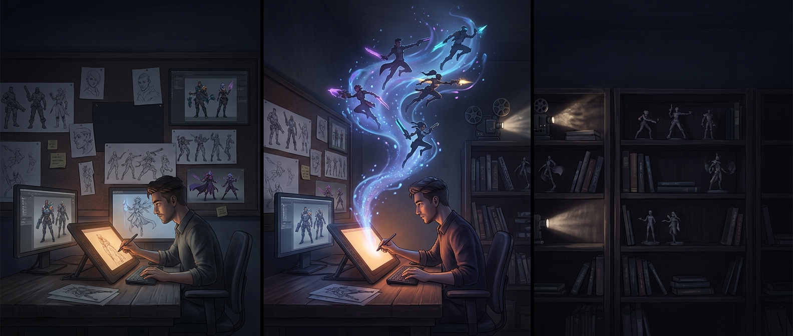
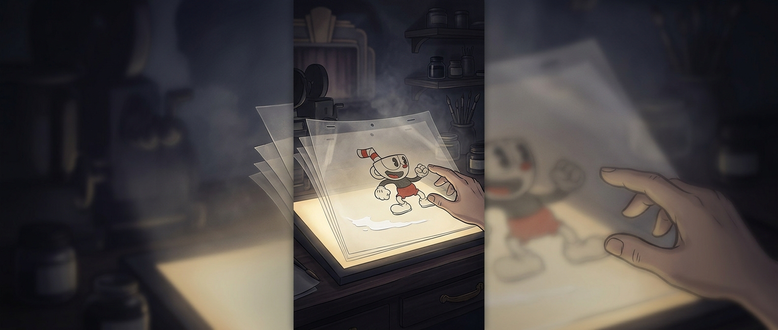
In many games, an animator builds a character from movable parts—an arm, a leg, a face—and reuses those pieces in different poses. Cuphead took a more labor-intensive route: artists drew each pose as a separate image. That let a character’s outline, expression, and proportions shift subtly from moment to moment, as they do in old hand-drawn cartoons.
The drawings began on paper. Artists painted them onto transparent cels, clear sheets that could be layered over a background. Once photographed or scanned into the production process, those individual images could be arranged in sequence to create motion. The technique made every movement depend on a succession of crafted drawings, rather than on a computer smoothly rotating a fixed set of body parts.
A vintage look with a gameplay cost
That choice affected more than appearance. A boss’s squash, stretch, or sudden change of shape could be drawn to suit the action instead of being constrained by a reusable digital rig. But each new pose also required artwork, so elaborate animation demanded more work than simply adjusting a character model.
In a fast game, visual flourishes still have to leave the action legible. Players need to recognize an attack and react, even as a character bends or transforms. The hand-drawn approach gives Cuphead its lively, slightly imperfect cartoon motion; the practical challenge is making that motion expressive without obscuring what the player needs to see.