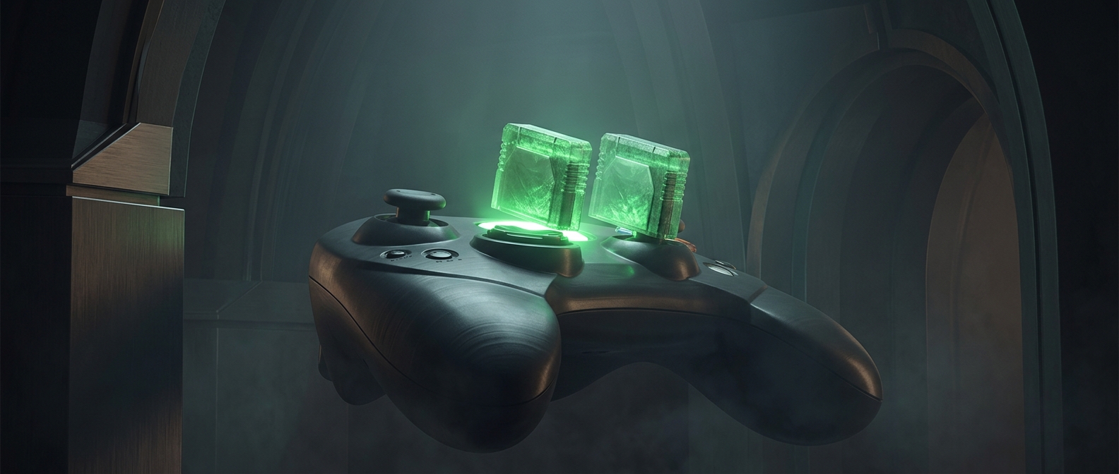
Why the Xbox’s green jewel took more than a surface badge
The original Xbox’s top emblem was designed to sit down inside the console’s casing, rather than simply lie flat on it. That made the badge part of the housing’s shape: the surrounding plastic had to form a clean, even border around it, and the insert had to fit securely without looking like an afterthought.
That kind of fit is demanding in a mass-produced plastic shell. The casing and jewel had to meet at the right depth and align neatly; small mismatches could leave an uneven edge or a loose-looking gap. Building the feature into the case therefore called for more involved manufacturing than attaching a conventional flat label or badge.
A visual effect without a functional job
The jewel did not serve as a control, vent, or status indicator. Its purpose was visual. The green material caught and filtered ambient light, giving the top of the otherwise dark console a distinctive glow without needing to illuminate the emblem from within.
That choice made the console recognizable from across a room, but it also spent manufacturing effort on appearance alone. The result is a small example of how industrial design can shape a product’s identity: even a decorative detail can influence the casing’s construction when it is embedded deeply enough to feel like part of the machine.