Why Park Dining Rooms Lean on Warm Colors
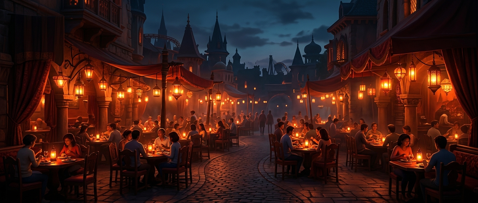
Bright reds, oranges, and yellows make a restaurant feel energetic and easy to spot amid the visual bustle of a theme park. They stand out on signs, counters, and seating areas, helping guests recognize food locations quickly while navigating crowds and attractions.
Warm colors can also shape how a dining space feels. Red and orange are often associated with heat, ripe food, and lively activity; yellow reads as cheerful and high-energy. Those associations can make a meal seem inviting and keep the room’s mood in step with the park. Color does not trigger the same response in everyone, and it is only one influence on appetite or how long guests stay.
Color Is Part of the Turnover Strategy
Park restaurants must serve many people in limited time, especially during busy meal periods. A bright, stimulating interior can support a quick-service atmosphere: guests find the counter, order, eat, and make room for the next group. But layout, menu design, queue flow, and the type of service matter more than color alone in determining how quickly tables turn over.
The palette also has a practical job beyond the dining room. Strong, contrasting colors make food stalls and restaurant entrances legible from a distance, where guests may be scanning for a familiar sign rather than studying the surroundings. In that setting, the colors help do two things at once: make the food area feel inviting and make it easy to find.