The checkout turns a headline into a last-second pitch
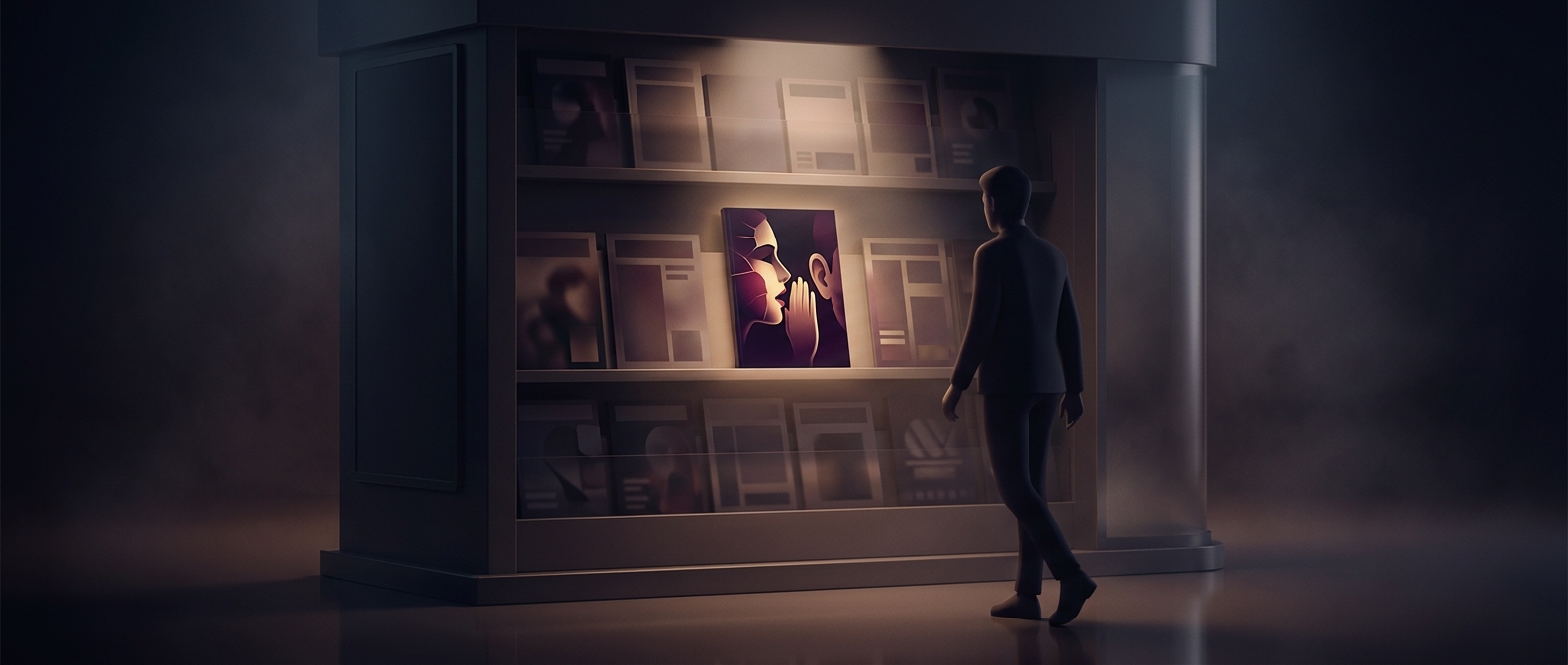
A shopper moving through a store is usually focused on a list, a basket, or the next errand. At the checkout, that movement pauses. The queue gives the eyes a few spare moments—and puts nearby magazine covers within easy view. A headline placed at eye level can use that brief pause to compete for attention without asking the shopper to search for it.
Sensation works before commitment
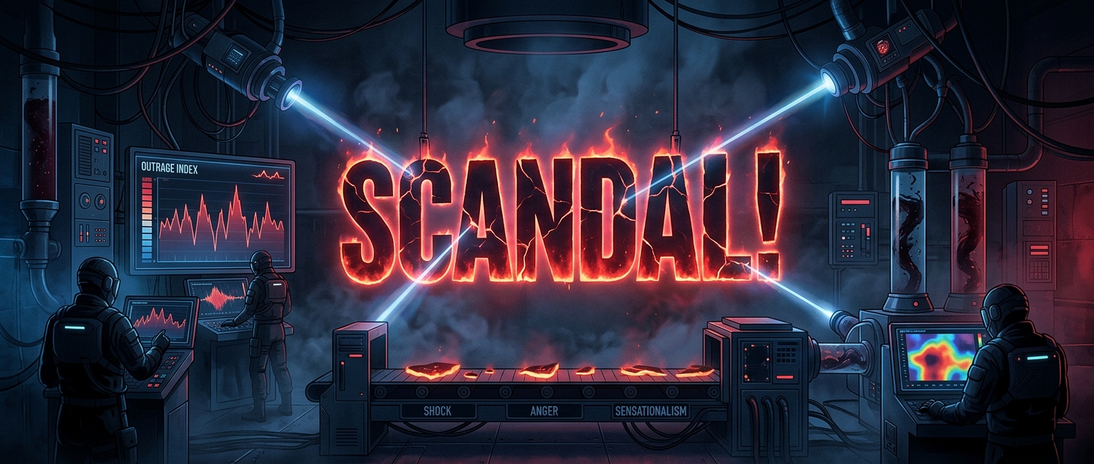
A dramatic headline is designed to communicate its hook quickly: a scandal, a shocking revelation, or a striking promise. That makes it suited to a glance. The shopper does not need to pick up the publication or read an article to understand the pitch; the cover offers a small burst of curiosity that may prompt a closer look or an impulse purchase.
The position also matters because checkout is close to the moment of payment. A shopper has already chosen to buy something, but may still have time to add a low-cost extra. A visible cover can turn waiting time into a final opportunity for the publication to make its case.
The shelf is part of the message
This is a practical choice, not merely a matter of making covers look dramatic. Stores have limited display space, and the most visible spots are valuable. Putting attention-grabbing headlines where waiting shoppers can readily see them helps tabloids compete for notice at the point when a purchase is still possible. The headline catches the eye; the checkout pause gives it a chance to hold it.