Why the euro sign looks the way it does
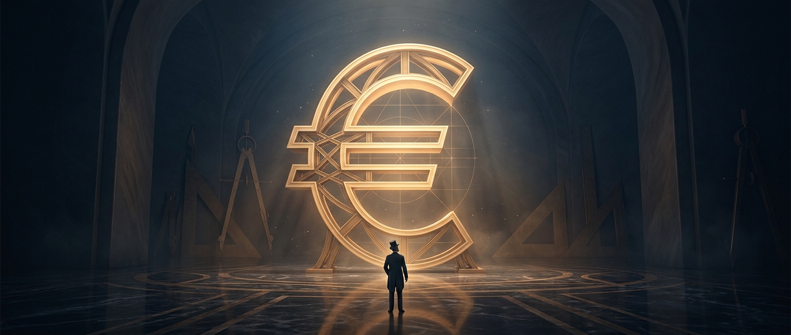
The € was designed to identify a shared currency at a glance, but its shape also carries a message about Europe. Its curved form is based on the Greek letter epsilon, a reference to the continent’s classical heritage. The mark is not simply a stylized letter: it was developed as a distinct symbol that could work across languages and national borders.
A currency needs a sign people can use
A common currency needs more than coins and banknotes. Prices must be displayed, amounts typed, and transactions recorded in many countries. A compact, recognizable symbol makes those everyday tasks easier and gives the currency a consistent visual identity—whether it appears on a shop label, a receipt, or a screen.
The euro sign’s two horizontal strokes add a second layer of meaning: they represent stability. That idea matters for a currency because money depends partly on confidence that it will remain a dependable way to quote prices and settle payments. The lines turn that aspiration into a simple visual cue, rather than a technical guarantee about the currency’s value.
A symbol shared across borders
Together, the epsilon-inspired curve and the parallel bars link a European reference with the practical promise of a stable common currency. Each time the € appears beside a price, it does more than identify the unit of money: it makes a cross-border economic project legible in a single character.